Ready to learn Data Science? Browse Data Science Training and Certification courses developed by industry thought leaders and Experfy in Harvard Innovation Lab.
Recently I read the book “How to lie with statistics” by Darrel Huff. The book talks about how one can use statistic to make people conclude wrong. I found this an exciting topic, and I think that it is very relevant to Data Science. This why I want to make the “Data Science” version of the examples shown in the book. Some of them are as in the book, others, are examples of what I saw may happen in real life Data Science.
This post is not really about how to lie with Data Science. Instead, it’s about how we may be fooled by not giving enough attention to details in different parts of the pipeline.
Charts

Consider yourself as a new data scientist in some company. This company already has a data science team that builds a model to predict something important. You are a very talented data scientist, and just after one month, you were able to improve their model accuracy by 3 percent. Incredible! You want to show your progress to someone, so you prepare this chart:
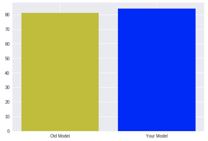
Now, this looks nice, but not very impressive, and you want to impress, so what can you do (other than improving your model even more)?
All you need to do to show this same data more impressively is to change the chart a bit. You need to make it focus on the change. There’s no “real” need in all those numbers below 80% or above 85%. So it can look like this:
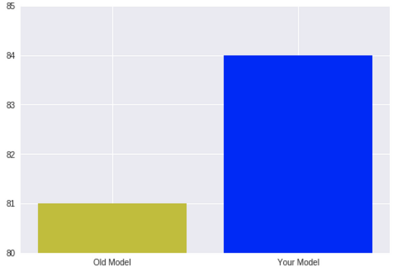
It looks like your model is now four times better than the old one! Of course, a smart reader will understand exactly what happens, but this chart looks impressive, and lots of people will remember this huge gap instead of the exact numbers.
We can do the same things with process over time. Let’s say you and your team work on some model, and you had a breakthrough in the recent weeks, so your model performance improved by 2%, very nice. It looks like this:
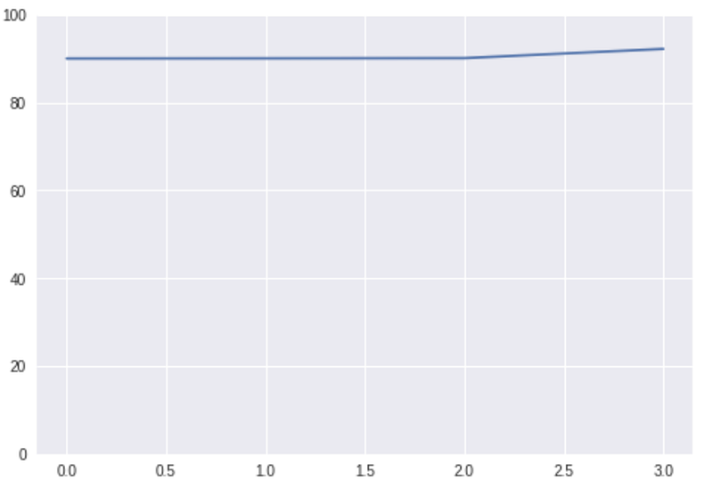
It is tough to see the change, the actual numbers there are [90.02, 90.05, 90.1, 92.2]. Again, maybe 2% is a significant improvement, but in this chart, it doesn’t look so good. So let’s change it in the same way we did before:
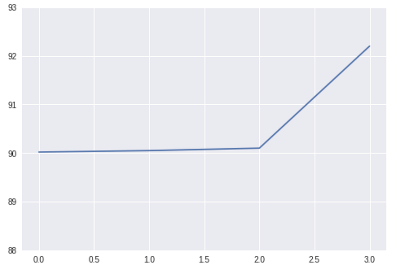
Again, those are the same numbers, but this chart looks much better than the previous one.
Measurements

Very often, junior data scientist don’t pay enough attention to what metric to use to measure their model performance. This may lead to usage of some default and most of the time wrong metric. Take accuracy for example, in real life (in most cases) it is a very bad metric. This is because in most problems in real life, the data is unbalanced. Consider a model that predicts survivors on Titanic, A very popular tutorial on Kaggle. What if I told you that I built a model that archives 61% accuracy. Is it good? It is hard to say. We don’t have anything to compare it to (more on this later). It sounds ok. It is probably much better than nothing, right? Let me show what I did exactly:
predicted = np.zeros(len(test_df))
print accuracy_score(predicted, test_df['Survived'])
That’s right, all I did is predict “zero” ( or “No”) for all the instances. I can get this accuracy (61%) simply because the number of people who survived is lower than people who didn’t. There are far more extreme cases where the data is very unbalanced, in those cases, even 99% accuracy may say nothing. One example of such an extreme unbalanced data is when we want to classify some rare disease correctly. If there’s only 1% of people who have this disease, then just by predicting “No” every time, will give us 99% accuracy!
This is relevant not only to accuracy. When we read results of some research/trial/paper (or in case we publish our results) we need to make sure that the metric used is appropriate for the problem it tries to measure.
Another important thing we need to do with measurements is to understand how good or bad the results are. Even when we use the right metric, it is sometimes hard to know how good or bad they are. 90% precision may be excellent for one problem, but very bad for others. This is why a good practice is to create a benchmark. Create a very simple (or even random) model and compare your/others results against it. For the Titanic problem, we already know that just by saying “No” to everyone will give us 61% accuracy, so when some algorithm gives us 70%, we can say that this algorithm contributes something, but probably it can do better.
Leaks

I want to talk about 3 types of leaks I’ve encountered during my data science history. Feature engineering/selection leaks, dependent data leaks, and unavailable data leaks.
Feature engineering/selection leaks:
In most cases, we need to do some preprocessing and/or feature engineering to our data before pushing it into some classifier. Many times it is easy to do so using some class (Transformer), here’s a sklearn example:
For those who are not familiar with sklearn or python: In the first line I’m getting my data using some method. Then I’m using SomeFeaturesTransformerclass to extract features from the data. Then I split the data into train and test and finally train my classifier.
You see the leak here? Most of the times, feature extraction/selection is part of the model, so by performing this step before the splitting, I am training part of my model on the test set! A straightforward example of this is when we want to use some statistical data about our features. For example one of our features may be the deviation from the mean. Say we have house size-price prediction, and we want to use how different current house size from the average house size as a feature. By calculating the mean on the whole data (and not just the train set), we introduce information about the test set to our model! (the mean of the data is part of the model). In this case, we might get outstanding results on our test set, but when we use this model in production, it will produce different/worse results.
Our model is not just the classifier at the end of the pipeline. We need to make sure that no parts of our model have access to any information about the test set.
Dependent data leak:
In my thesis work, I build a system that tries to classify recordings of utterances into typical and atypical speech. I have 30 participants with 15 utterances each repeated 4 times. So a total of 30*15*4=1800 recordings. This is very little data, so instead of just splitting it into train and test, I want to do cross-validation to evaluate my algorithm. However, I need to be very careful, even without cross-validation, when I randomly select some percent of my data to be a test set, I will get (in high probability) recordings of all the participants in the test set! That means that my model is trained on the participants it will be tested on! Of course, my results will be great, but my model will learn to recognize the different voices of different participants and not typical or atypical speech! I will get a high score, but in reality, my model isn’t worth much.
The right approach to this is to split the data (or do cross-validation) on the participants level, i.e., use 5 participants as the test set and the other 25 as the train set.
This type of dependent data may appear in different datasets. Another example of this is when we try to create a matching algorithm between jobs and candidates. We don’t want to show to our model jobs that will appear in the test set. We need to make sure that all parts of our model never saw any data from the test set.
Unavailable data leak:
This is a very common one. Sometimes, we have columns in our data that won’t be available for us in the future. Here’s a simple example: We want to predict user satisfaction regarding products on our site. We got a lot of historical data, so we built the model using it. We have a field called User Satisfaction which is our target variable. We got excellent results, and we are happy. However, when we use our model in production, it predicts absolute non-sense. It turns out that in addition to general user satisfaction, other fields provided by the user. Fields like whether or not the user is satisfied with the delivery, the shipping, the customer support and so on. These fields are not available for us in prediction time and are very correlated (and predictive) to general user satisfaction. Our model used them to predict general satisfaction and did it very well, but when those fields are not available (and we impute them), the model doesn’t have to contribute much.
Chance/Luck

Let’s get back to the typical-atypical speech problem. As I said there are only 30 participants, so if I do a simple 20%-80% train-test split, I’ll get only 6 participants to test on. Six participants are very little. I might classify correctly 5 of them just by chance. I even may classify all of them correctly just because I was lucky. This will give me 100% accuracy! (or 83% in case of only 5 correct). It might look excellent, and when I’ll publish my results it will look very impressive, but the reality is that this score is not significant (or even real).
If we assume that there’s a 50% of people have atypical speech, then just by randomly guessing I’ll be right 50% of the times, that means that if I try to guess for 6 participants, I’ll classify all of them correctly 0.5⁶=0.01 (1%) of the times. i.e., 1 out of 100 random models will have 100% accuracy! (and 3 out of 100 will have 83% accuracy).
The right approach here is to do “leave one out cross-validation” and use all of the participants as a test.
Humans

It is very tempting to compare learning algorithms to humans. This is very common in many medical fields. However, comparing humans and machines is not trivial at all. Let’s say we have an algorithm that can diagnose a rare disease. We already saw that using accuracy as measurements is not a good idea with unbalanced data. It this case, it might be much better if we use precision and recall for our model evaluation and comparison. We can use precision and recall of some doctor and compare it to our algorithm. However, there’s always a tradeoff between precision and recall and it not always clear what do we want more, high precision or high recall. If our algorithm got 60% precision and 80% recall and the doctor got 40% precision and 100% recall, who’s better? We can say that the precision is higher and thus our algorithm is “better than human”. Also, as an algorithm, we can control this tradeoff, all we need to do is to change our classification threshold, and we can set the precision (or the recall) to the point we want it to be (and see what happens to recall). So an even better option is to use ROC AUC score or “Average Precision” for model evaluation. These metrics take into consideration the precision-recall tradeoff and provide a better metric about how our model is “predictive”. Humans don’t have ROC AUCs nor “Average Precision”. We can’t control (in most cases) this threshold in any doctor. There are different techniques to provide the precision-recall curve for a set of human decision makers, but those techniques almost never used. Here’s a great and much more detailed post about this:
Conclusion
In this post, I showed different pitfalls that might occur when we try to publish some algorithm results or interpret others. I think the main idea to take from this is “When it looks too good to be true, it probably is”. When our model (or others) looks surprisingly good, we have to make sure that all of the steps in our pipeline are correct.

