Did Reuters and Fox News intend to mislead their audiences by these terrible charts?

Excerpted from Killer Visual
Strategies by Amy Balliett, with permission of the publisher, Wiley. Copyright © 2020 by ReelRandom, LLC. All rights
reserved. This book is available wherever books and ebooks are sold.
Whether in school or in the workplace, the majority of us have had to either read or create charts and graphs at some point in our lives. This graphic representation of data, called “data visualization” or “data viz,” has been our go-to method for understanding how numbers correlate to one another for centuries. In fact, the first-ever line and bar graphs were developed as early as 1786, when William Playfair released The Commercial and Political Atlas.
Playfair wanted to compare the total amount of exports to the total amount of imports in Scotland over a single-year period (from 1780 to 1781), broken down by source/destination. To chart total numbers, identify locations, and differentiate imports from exports, he realized that a combination of bars and scales would do the trick. The result was the first recorded bar graph in history, pictured above.
At the time, Playfair was navigating uncharted waters, but today, charts and graphs are extremely commonplace. Over the years, tools such as Excel, Tableau, and PowerPoint have made it extremely easy for us to quickly visualize data sets and share them widely. Given this, you might be surprised to learn that mistakes in data visualizations run rampant in the world of visual content. For instance, it’s common to assume that comparing numbers to one another always requires a bar chart, while showing percentages always requires a pie chart. Or sometimes it’s assumed that a bar chart can have multiple scales, or worse, no scale at all.
We have taken charts and graphs for granted. Because they’re so easy to produce, we automatically assume they’re accurate. But tools such as Excel and PowerPoint just visualize the numbers we input; they don’t consider the context of those numbers to determine their best graphical representation.
To identify the right visualization to use, we must first consider the story we are trying to tell, just as Playfair did. We must consider how the associated numbers correlate to one another and to the context in which the data was collected. Without this information, the potential that the data will be improperly visualized grows exponentially — an issue that can greatly hinder the success of any visual content strategy and the reputation of the brand that publishes that incorrect data viz.
Case in Point: Don’t Skip the Scale
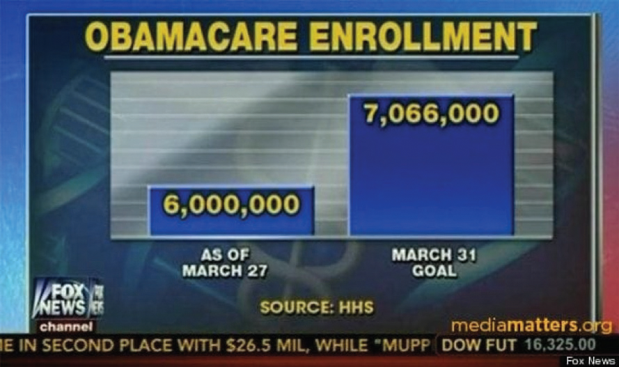
During the heated debate over the Affordable Care Act (ACA) in 2014, a Fox News broadcast displayed a data visualization suggesting that the demand for health care under the ACA was lower than expected, with the implication that the ACA was not successful. The image below shows a screenshot from that broadcast.

After an initial glance at this image, we might quickly agree with the assertions noted in the broadcast. But upon closer inspection, we can see that the scales are completely off. By starting the x-axis at approximately 5,250,000 and not labeling it as such, the March 27 data appears to total just 30 percent of the 7,066,000 goal. This disparity signals to a viewer that there is a very long way to go to reach the end goal, with only days left.
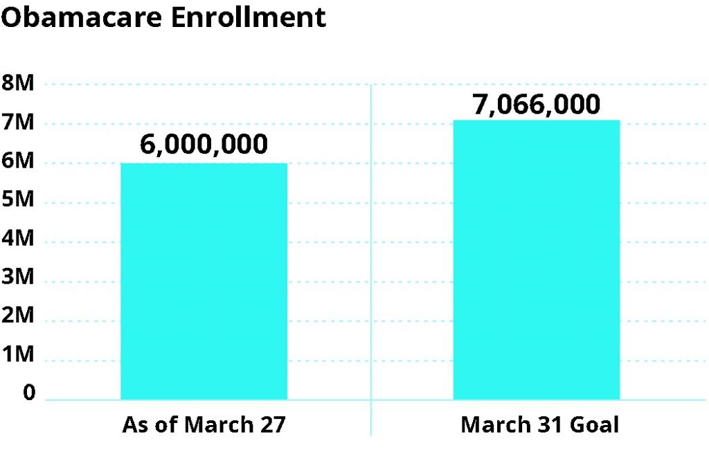
But in reality, 6,000,000 is 85 percent of the end goal. That’s a significant difference. In fact, there was plenty of time left to achieve the Obama administration’s goal of more than seven million enrollees.
For comparison, check out the next image to see how this data should have been visualized.

When visualizing data, it’s very important to give viewers all relevant context so they can draw their own conclusions from unbiased visualizations. Manipulating scales, start points, and layout can lead to incorrect data interpretation. At best, this is an unintentional misrepresentation of information; at worst, it can deliberately mislead the audience in order to further a particular agenda.
Adhere to the Common Language of Data Viz
When it comes to data visualization, we share a common visual language that ensures fluency in communication and understanding. Pie charts always add up to 100 percent.
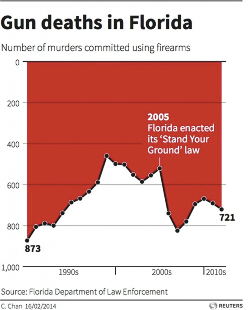
Horizontal timelines show past on the left and the future to the right. The list goes on. Designing contrary to this visual vernacular will only cause confusion. As an example, check out the line graph in this graph, which was released by Reuters in 2014 and quickly incited political debate.

Remember the phrase we all learned in school to best differentiate the y-axis from the x-axis? “Y to the sky!” Inherent in the phrase is the assumption that the bottom of the y-axis symbolizes the lowest number in the data set, while the highest number in the set lives at the top of that axis. In other words, up means up and down means down. If you were to strip away all the labels from any line or bar graph, you would still be able to identify trends because of this standard expectation.
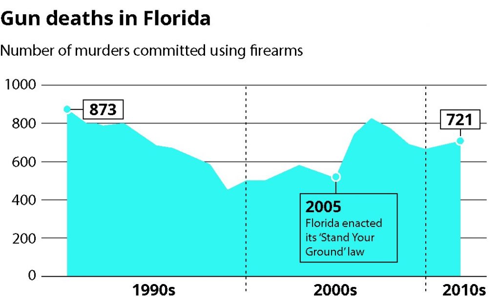
The Reuters graphic, however, inverted this rule by flipping the y-axis. Instead of seeing the passage of the “Stand Your Ground” legislation as a potential catalyst for the marked increase in gun deaths in the early 2000s, the viewer is led to mistakenly conclude that this law coincided with an immediate decrease in gun deaths.
This image shows how this graph should have been visualized instead:

With the Reuters example, it’s not clear if the graph choice was made because they wanted to add a unique spin on their data visualizations or because of an attempt to lead the viewer to incorrect conclusions. That uncertainty hurts the Reuters brand and provides a perfect example of why properly visualizing data is imperative to any visual strategy.


