Ready to learn Data Science? Browse courses like Effective Data Visualization developed by industry thought leaders and Experfy in Harvard Innovation Lab.
The greatest value of a picture is when it forces us to notice what we never expected to see. — John W. Tukey
Inspite of the tremendous promise of data visualisation, and the discipline being mainstream for about a decade, it is anything but mature. With a boatload of visualisation tools at disposal and fancy data scientists to play with them, impactful use of data visualisation is still a rarity in enterprises.
Thanks to sustained advances by practitioners and marketing blitzkrieg of the top players, visualisation has reached the deep shores of organisations. The investment and awareness notwithstanding, Business ROI from visualisation initiatives or long-term adoption of tools is hard to come by.
At times, one wonders what makes the visual display of information so tough.
- Perhaps it’s got to do with the reduction of information design to lame, but slick dashboards displaying an assortment of KPIs.
- Maybe it's the fancy charts and dazzling functionalities that have somewhere lost the pulse of the users.
- Or, it’s the well-meaning initiatives that have gotten derailed midway due to conflicting priorities & confused execution.
Can we look at the key failure points in visualisation projects? Or, as a visualisation practitioner would you like some funny reflections of shared frustrations? Read on for a sampling of our experience at Gramener, from close to a decade of implementing visual intelligence at enterprises. Lets also discuss how these pitfalls can be tackled.

Photo: Isaac Davis on Unsplash
1. “I embody all the End Users.. look no further”
End users are often not directly engaged while defining needs for visualisation projects. One often hears the project sponsor or manager say that they ‘exactly know what the users want’. Either the user’s time is not easily available (CXOs..) or there are too many of them (Ops staff). And they are conveniently ignored with a naive assumption that others can cover for them.
This is a prime reason why visual dashboards often go unused after rollout. If just the listing of common asks or definition of KPIs were sufficient, this challenge woudn’t arise. Whats really needed is maping of user stories, and hearing how users approach business problems. This is the user’s practical wisdom that can’t be transferred, and which is closely linked to actionability.
Its critical to onboard the end users and gather their nuanced business perspectives so that it can be built into dashboards. Build the user persona through interviews, map the user journey by gentle probing, and jointly sketch out the as-is business scenarios. Its also helpful to list the questions that will be answered by the visualisation, and clarify on the ones that will not be.
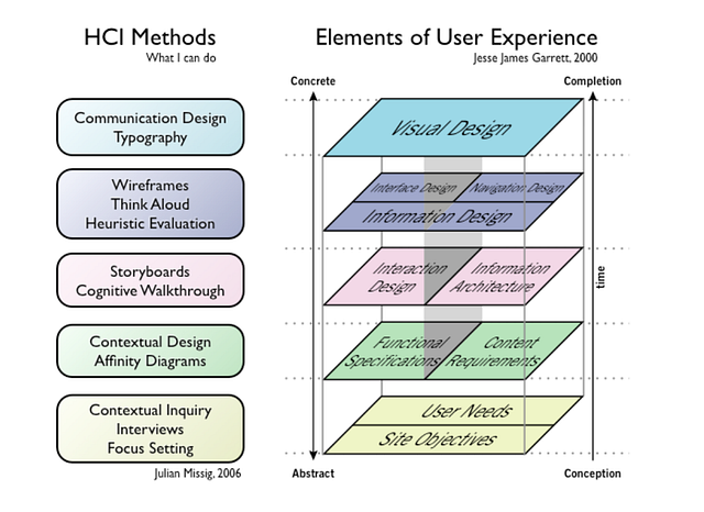
Keeping User at the foundation of Visual Experience (Source: Julian Missig, 2006, Jesse James Garrett 2000)
2. “Can I have all of the above features?”
When proposed with various competing options for visualisation, how often have you heard the answer, ‘All of the above’? Users develop an acute sense of insecurity when asked to prioritise, and fear that a future scenario may go unaddressed. If its the first visualisation project for an enterprise, the urge to fit in all possible bells and whistles is heightened.
Sponsors miss to see that the more you dump into an application, the lesser it will get used. While one gets a false sense of satisfaction by checking all boxes, the cognitive load could get so high that users simply stop using it altogether. When it comes to prioritisation, the most knowledgeable users may not have the right perspective to take hard calls, or the gumption to bite the bullet.
Its important to play a consultative role and help whittle down the feature list to the most critical. While screen space is technically unlimited, its useful to impose constraints on data density, such as ‘nothing more than a non-scrollable screenful’. Onboard stakeholders who know the priority, who can take hard decisions and also champion the many battles needed to convince other users.
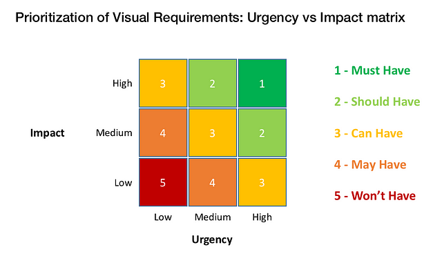
UI Matrix — A framework for prioritisation of Visual Requirements
3. “Do you really need data for visualisation?”
It can get outright bizarre when the need for data is questioned in a data visualisation project. One can consider themselves lucky if they have not been told, “Build the dashboard first, and plug in data directly at Go-live”. Yes, there are challenges in cleaning data and preparing the feeds, but designing dashboards sans any data is like putting a cart before the horse.
Retrofitting data is the root cause for ending up with non-actionable dashboards or weird-looking charts. Without exploratory analysis, charts could be skewed by outliers or worse, end up without patterns. Choice of charts is also driven by data. For example, revenue distribution of upto 4 products can be a stacked bar, but for more, charts like treemap are relevant.
As part of project planning, its critical to account for data upfront. While getting the header rows is a useful start, full data is essential before critical design decisions can be taken. Clients must be educated that data is indeed in the critical path of visualisation, and that data insights drive design decisions.
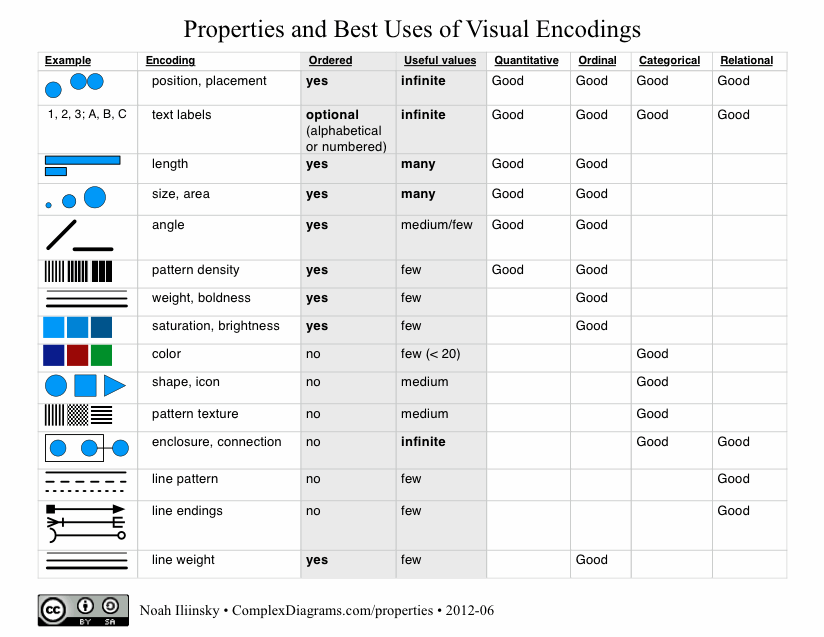
Mapping the data types to their Visual Encodings by Noah Illinsky
4. “Please give me my Sunburst”
At times people fall so much in love with a chart, that they fatefully try extending this relationship beyond the scope of cool visualisation examples. This leads to unproductive force-fitting of charts into the solution. The compromises made for this adjustment can wreak havoc on the entire project.
Those who demand exotic or 3D charts even when usecases don’t support it, are doing so for their own satisfaction, and end up alienating users. It's not a buffet where one can pick an assortment of fancy charts to serve up on the platter. One might have a crush on the Sankey chart or Chord diagram, but it would be a disaster to give these charts to a non-data savvy audience.
The choice of chart is a science and there are robust disciplines like grammar of graphics that govern it. Factors to pick a chart include: type of representation (distribution, trend..), data points (few, more..), user’s role (operational, strategic..), user’s data familiarity (analyst, business user..) etc. One must actively educate users on the rationale and explain with examples.
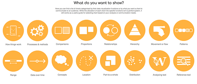
A catalogue of Data visualisations : Source datavizcatalogue
5. “I want a rich UI.. can you make everything clickable?”
When designing navigation and interactivity, a common request is to “Enable deep drill-in to the last level, and make everything clickable”. If dumping the entire world into a single screen is a common fantasy, making it all clickable is closely related. When pushed to prioritise features within a screen, a common excuse is for users to try and hide entire dashboards behind unrelated clicks.
Burying a hundred clicks into a single screen turns visualisations into an easter egg hunt. The user may never know where useful information may be hidden in the dashboard. In most applications, over 90% of clicks are never used, and it's just the 10% that natively fall into a user’s workflow that matter.
Rich UI doesn’t mean many clicks, it means just the right and intuitively placed ones. It may be useful to impose some guidelines, say, no more than 8 clicks per screen. Data stories can be equally powerful in the static format, so carefully question the interactivity needed. Users will be thankful for this call.
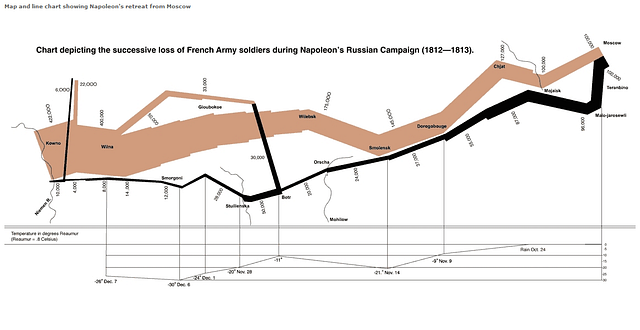
A powerful visualisation – static, with a shelf life of 200 years: Napoleon’s failed Russia campaign
6. “I’d like green and blue.. and, throw in some purple”
While all of the points covered so far can be rationalised, the same cannot be said about color. Statements such as “Something seems missing in the dashboard” or “This visual misses the wow effect” gives practitioners goosebumps. Whip us if you have to, but don’t leave the feedback hanging.
Each user has their choice of colors and they can get pretty opinionated. Unfortunately, this can have a huge bearing on the application’s acceptance. And color is not just about look-and-feel. We learnt this painful lesson on a project that had users with red-green color blindness. Our rich dashboard with RGB palette showed up as a single blob of colour, making it unusable.
Color theory is more an art than science, though there are standard guidelines to handle the aesthetic, functional and social aspects. Its best to go with the user persona and application requirements, rather than trying to please everyone. One must also take the effort to articulate choices and help resolve disconnect, since most users are unable to explain their colour preferences.
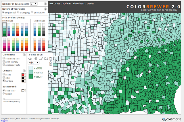
Color advisor tool — Colorbrewer
Summary
While we’ve seen the 6 critical points of failure in data visualisation projects, they also happen to fall in the six key stages of visualisation engagements. Hence, getting them right by avoiding the pitfalls can tilt scales towards overall success of the initiative.
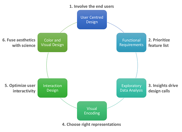
Visualization should be seen as a medium of story telling using data. A visual story is a perfect blend of art and science. Practitioners must hone their skills to fuse the right aesthetic ingredients with scientific elements. This creates an output that is relevant for users, solves a specific business challenge and delivers ROI for enterprises.
Numbers have an important story to tell. They rely on you to give them a clear and convincing voice. — Stephen Few


