A picture really does say a thousand words.
“Visualization is really about external cognition, that is, how resources outside the mind can be used to boost the cognitive capabilities of the mind.” — Stuart Card
This article focuses on the importance of visualization with data. The amount and complexity of information produced in science, engineering, business, and everyday human activity is increasing at staggering rates. Good visualizations not only present a visual interpretation of data, but do so by improving comprehension, communication, and decision making.
The importance of visualization is a topic taught to almost every data scientist in an entry-level course at university but is mastered by very few individuals. It is often regarded as obvious or unimportant due to its inherently subjective nature. In this article, I hope to dispel some of those thoughts and show you that visualization is incredibly important, not just in the field of data science, but for communicating any form of information.
I will aim to show the reader, through multiple examples, the impact a well-designed visualization can have at communicating an idea or piece of information. In addition, I will discuss the best practices for making effective visualizations, and how one can go about developing their own visualizations and the resources that are available to go about doing this.
I hope you enjoy this visual journey and learn something in the process.

What is Visualization?
The American Heritage Dictionary defines visualization as:
(1) The formation of mental visual images.
In the context of visualization with data, it is necessary to add something to this definition, so that it becomes:
The formation of mental visual images to convey information through graphical representations of data.
If you are pursuing a career in data science, this is one of the most crucial skills that you can master, and it is transferable to virtually any discipline. Let us imagine that you are trying to convince your manager to invest in a company and you present them a spreadsheet full of numbers to explain to them why this is such a good investment opportunity. How would you respond if you were the manager?
If presented in visual form, information is often much easier to digest, especially if it makes use of patterns and structures that humans can interpret intuitively. If you want a quick and easy visualization that requires little to no effort, you can go with something like a pie chart or a bar chart. In terms of developing visualizations, this is often as far as most people go, and often, it is as far as they made need to go for there field of expertise.
Another factor that inhibits our use of visualizations is the amount of data we have available. How do I know if visualization is an appropriate method to communicate a message?
This is a difficult question to answer. One design study recommends that we assess the viability of using visualizations based on the clarity of our task and the location of the information.
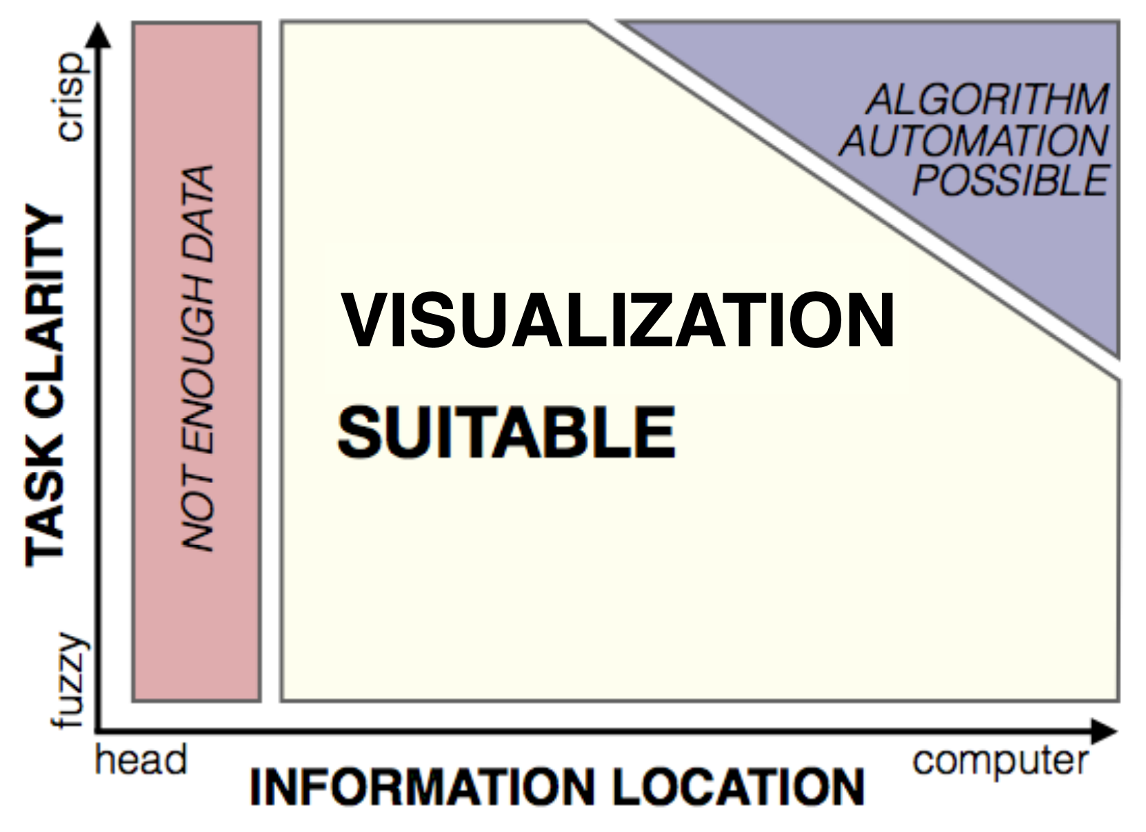
Design Study Methodology: Reflections from the Trenches and the Stacks, Michael Sedlmair, Miriah Meyer, and Tamara Munzner. IEEE Trans. Visualization and Computer Graphics, 2012.
If we are in the top right corner of this diagram, it becomes feasible to develop and program interactive visualizations, which is the realm in which data scientists are now entering due to the persistently increasing scale of data resulting from the information explosion.

Information Explosion.
We are now living in a data-driven world, and it is only likely to become more data-driven. This is clear from multiple areas, such as important advances in developing large-scale sensor networks as well as artificial intelligence agents that interact with the world (such as self-driving cars).
In a world where data is sovereign, having the power to develop clear and impactful visualizations is becoming an increasingly necessary skill.
Good and Bad Visualizations
Humans have been creating visualizations for thousands of years, and whilst the drawings of cavemen are slightly less spectacular than what we have nowadays, it is still good to appreciate just how powerful some of the early visualizations were, as well as how impactful they have been on the modern world.
Take Leonardo da Vinci, for example, an Italian polymath who was not only the first one to come up with incredible inventions such as the airplane, helicopter, and tank, but was also incredibly skilled at drawing. His engineering and anatomical drawings, like the ones below, are incredibly realistic and yet simple to understand.
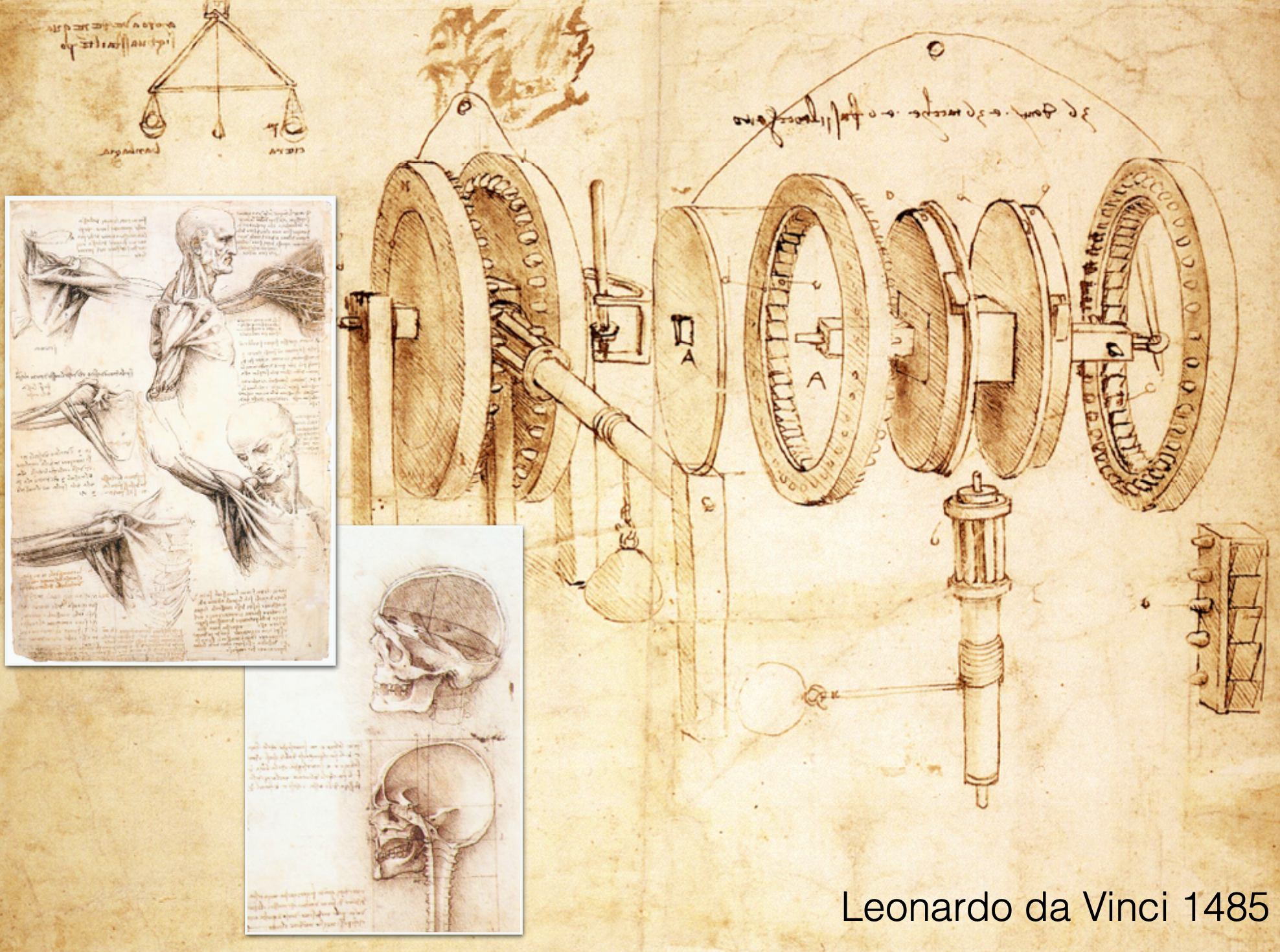
Being skilled at drawing was very necessary for the purpose of visualizations back hundreds of years ago when we did not have computers to draw things for us. Take a moment to admire Galileo’s sketches of the moon during different phases of the lunar calendar.

It is not often that we really stare at ancient drawings of the Moon, so is there really still a need for these types of visualizations in the modern world? And if there is, can we not just leave it to artists, graphic designers, and the like?
The answer is obviously yes. Even ten or fifteen years ago, learning something like chemistry was incredibly difficult, despite being able to picture molecules in your head, it is still tough to translate between complex scientific words and your mental picture of what is occurring. Nowadays, one can go on Youtube and type in a few words and watch a visualization or a visual walkthrough of essentially any aspect of chemistry. This same idea applies for essentially any abstract idea in science.
So now we have convinced ourselves that visualizations are pretty useful for conveying information, and can also be used to explain complex ideas in a more interpretable manner.
What are some examples of good visualizations?
I currently live in Boston, so several of the following visualizations are related to the city of Boston. These are just some visualizations that I consider good, and, due to their subjective nature, you may disagree with me.
The below visualization captures not only the time taken to each stop from the city center in the form of concentric spheres but also follows the correct direction for each line. Looking at this diagram, it is pretty quick to work out which line to take, which direction it goes, and how long it will take to get there.

This second visualization shows the movement of individuals that are born in Massachusetts over the last century. We see that in 1940, 82% of the people born in Massachusetts were expected to live in Massachusetts. Now fast forward to the modern day, we see that this number has decreased to 64%, and we can get a reasonable idea of where these individuals have migrated.

One of the most famous visualizations ever made was by Joseph Minard, and it depicts the journey of Napoleon as he marched towards Russia for his Russian campaign of 1812.

The illustration depicts Napoleon’s army departing the Polish-Russian border. A thick band illustrates the size of his army at specific geographic points during their advance and retreat. It displays six types of data in two dimensions: the number of Napoleon’s troops; the distance traveled; temperature; latitude and longitude; the direction of travel; and location relative to specific dates without making mention of Napoleon. Minard’s interest lay with the travails and sacrifices of the soldiers. This type of band graph for illustration of flows was later called a Sankey diagram.
A trend that you might have noticed with all of the above visualizations is that they convey multiple types of data in a relatively simple fashion. Doing this is an intelligible way is not an easy task.
Now let us consider the transformation of a poor visualization into a visualization better suited for its purpose. This is easiest to do with subway maps so I will consider the subway map of London, and we will see why it was changed and how their new design has improved upon the original design.
This was the original map of the London Underground that dates back to 1927. As you may have already noticed, the major problem with this diagram is that there is a large cluster of closely spaced underground stations due to their close proximity. This stems from the fact that the map is plotted based on the geographic locations of the stations. However, when going far out of the city, there are vast amounts of space left unused on the map.

In 1933, Harry Beck came up with a new design for the map of the London Underground. Beck decided that passengers on the underground were not concerned with geographical accuracy and were most interested in how to get from one station to another and where to change trains. He took inspiration from electrical diagrams and decided to show each of the lines in an individual color, and to show their connections to other lines as one would on an electrical diagram. The plot maintains the directional information for where each line goes, but the distance information is lost as it was deemed unnecessary by Beck.
As someone who used to live in London and used a modern version of this map to get around with relative ease, I can vouch for its brilliance.

We can see a very similar debate that occurred with the New York subway map. Which of these do you think is better?

Despite the fact we have looked at several subway maps, there is obviously not a clear-cut solution that can be applied to all situations. After all, it depends on what data is most relevant to the audience. Harry Beck decided that passengers did not care about distance or geographical information, only that they knew how to go from station A to station B and what connections to make. Maybe this idea would not work for New Yorkers because they are more concerned with knowing the distance and geographic location than Londoners.
Anscombe’s Quartet
Numbers can be incredibly misleading, as was demonstrated by Gertrude Anscombe in the form of the now famously known Anscombe’s Quartet. The quartet is a set of four data samples that have exactly the same mean, variance, correlation, and linear regression line.
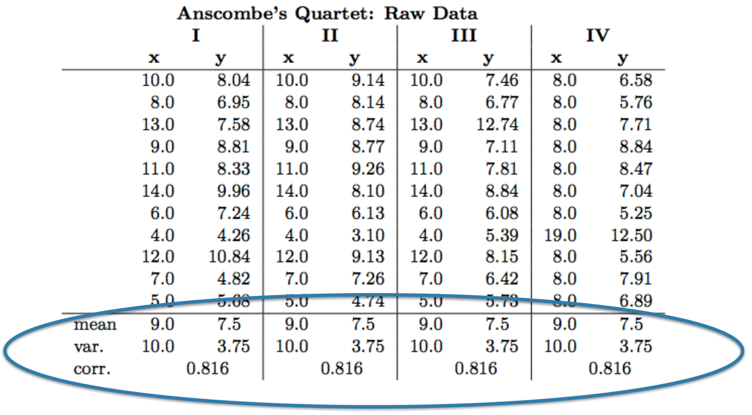
Anscombe’s Quartet in tabular form (Anscombe, 1973).
However, it is clear from a visual representation of the results that the distributions of the four sets of data are completely different.

Anscombe’s Quartet in visual form (Anscombe, 1973).
To reinforce this point I have developed six of my own data plots, all of which have the same mean, variance, correlation, and linear regression line. As you can see below, these are, again, completely different.

This idea that visualizations can be used in place of quantitative metrics to make the structure of the data clearer and more meaningful leads us to naturally into the realm of misleading visualizations. Just as numbers can be used to mislead us about the structure of our data, as we have seen from Anscombe’s Quartet, it also works the other way around, visualizations can be cleverly made to distort the underlying structure in the data. As we shall see, this is a very common occurrence, especially in areas that are prone to discourse such as politics and scientific debates.
Misleading Visualizations
There are numerous examples of people using statistics to mislead individuals. Indeed, this is an extremely common tactic used in politics. Possibly one of the most famous examples of this was related to tax cuts proposed by President George Bush, in which a 5% increase was made to look much larger by distorting the axis of a bar chart.

(Left) The visualization shown to viewers, and (right) a less deceptive visualization.
These deceptive tactics often involve distortion of the measurement axes, as in the above example. Here is another example of axis distortion related to job losses (ironically, also related to U.S. politics).

In reality, the plot should look like this.

Another way that people are deceived through the use of visualizations is through the omission of data.
I, myself, am an environmental scientist, so I am only too aware of the deception people can espouse with carefully crafted visualizations. Here is a prime example of one showing that global warming is a myth (which, just to clarify, it is not, and this idea has not been contested by environmental scientists since the 1990s).

A less deceptive diagram is shown below.

As of now we just discussed visualizations that are actively designed to deceive us. How about when it is done accidentally?
Beware of Rainbows

Rainbow color maps are probably the most annoying visualization I come across on a daily basis. As an environmental scientist, I see these pretty much everywhere. Not only are these bad to use because colorblind people (such as myself) can have issues differentiating many of the colors, but assigning a color to a quantitative value is nonsensical.
The rainbow colormap is perceptually non-linear. Who decided that blue represents a quantitatively lower value than yellow or red? When do the transitions occur and how sudden are they?

Rainbow color maps.
The best way to tackle this is to stick to just two colors and use a linear change in color to represent quantitative values. In this sense, the plot can be colored but the quantitative nature of the plot is described by the brightness of the color, with darker regions typically indicating higher values. This idea is illustrated below.

This essentially makes them the same as a heat plot or a choropleth map like the one below.

A nice example of this is shown for U.S. votes following the 2016 presidential election.

Color Blindness
It is always good to keep in mind the fact that a reasonable amount of people are colorblind and to avoid using color combinations that can be problematic for these individuals. Take the following visualization as an example.

The colors used in this diagram are a terrible combination for someone who is suffering from red-green color blindness (can be deuteranopia or protanopia). It is best to be mindful of at least using combinations of red and green since this type of color blindness is the most prevalent.
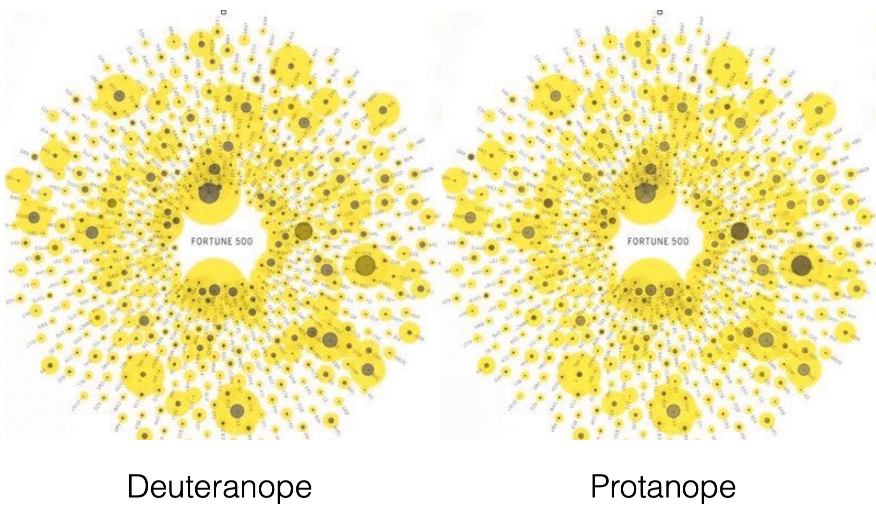
If you are interested in learning more about color blindness, there is a nifty website for simulating color blindness. Coblis – Color Blindness Simulator
Edge Bundling
The idea behind edge bundling is essentially wrapping an elastic band around all of the paths that follow the same route from one node to another node. This is used on network diagrams and has the advantage of making the visualization look less a cluttered hairball, and is more inherently pleasing as we can see below.
The downsides to this method are that you cannot follow the exact links or paths after bundling, which mean that our visualization does not reflect the underlying data (we forfeit some graphical integrity).

Overview of the Visualization Process
Now that we have looked at a bunch of visualizations and understand the difference between a good and bad visualization, it is a good time to discuss what actually makes a good visualization.
Visualization Goals
Essentially, there are three goals to visualization:
- Data Exploration — find the unknown
- Data Analysis — check hypotheses
- Presentation — communicate and disseminate
That is essentially it. However, these terms are pretty vague, and it is thus quite easy to understand why it is so difficult for individuals to master the art of communicating through visualizations. It is, therefore, useful to have a model to follow to help us meet these goals.
The Five-Step Model
Visualization is often described as the following five-step model, a process which follows a fairly logical progression.

Firstly, one is required to isolate a specific target or question that is to be the subject of evaluation.
This is followed by data wrangling, which is 90% of what data scientists do when they are working with data. This procedure involves getting the data into a workable format, performing exploratory data analysis to understand their data set, which may involve various ways of summarizing or plotting the data.
The third stage is the design stage, which involves the development of a story that you want to tell with the data. This is closely linked back to the target we defined. What is the message we are trying to communicate? This will also likely depend on who your audience is, as well as the level of objectivity of the analysis — for example, a political opponent is likely to want to send an exaggerated message of data in order to make their opponent look bad.
The fourth step involves the implementation of the visualization, such as via programming of interactive web-based visualizations using D3. This is the part of the process that involves some coding, whereas the design stage involves thinking, drawing, ideation, and so on.
The fifth stage is essentially a review stage, you look at your implementation and decide whether it sends the message that you want to communicate, or answers the question you set out to answer.
In reality, this is a non-linear process, although it is often presented as one. Here is a somewhat more realistic form of this model.

It seems simple right? Well, there are actually a lot of ways that you can screw this up, and often without realizing. Here are the three most common issues:
Domain situation — Did you correctly understand the users’ needs? Perhaps the wrong problem is being addressed. This is a problem associated with the target phase.
Data/task abstraction — Are you showing them the right thing? Perhaps the wrong abstraction is being used. This is also a problem associated with the target phase.
Visual encoding/interaction — Does the way you are showing the data work? Perhaps the wrong idiom or encoding is being used. This is a problem associated with the design phase.
Algorithm — Does your code break? Is your code too slow? Is it scalable? This is a problem with the implementation phase. Perhaps the wrong algorithm is being used.
It might be obvious to address the fact that your code is breaking, but how do you assess the more subjective problems we just addressed, such as the domain situation or the visual encoding used? We can lean towards evaluation metrics.
We can rely on qualitative and quantitative metrics. Qualitative metrics are often the most useful for visualizations since visualizations are developed for communicating information to people, some examples of metrics to use are:
- Observational Studies (“Think Aloud”)
- Expert Interviews (aka Design Critiques)
- Focus Groups
The idea of these qualitative procedures is that individuals should be able to see the visualization and understand the message you are trying to convey without any additional information. These types of studies and metrics are commonly used in areas such as marketing and web design because they provide insight into how individuals will interpret and respond to their ideas or designs.
Rules of Thumb
Edward Tufte is a pioneer in the field of developing effective visualizations and has written multiple books on the topic (I will reference these at the end of the article).
Here are three of his rules for effective visualization:
- Graphical integrity
- Maximize data-ink ratio
- Avoid chart junk
Graphical Integrity
We have already discussed this to somewhat extend when discussing misleading visualizations. In general, it is bad practice, and somewhat harmful to society, to try to mislead individuals with statistics.

Maximize Data-Ink Ratio
This rule of thumb is about clarity and minimalism. In general, 3D plots tend to be less clear and can be misleading in some cases. Examine the differences between the two charts below and decide which you think is better.

Avoid Chart Junk
Extraneous visual elements distract people from the message being conveyed.

Interactive Visualizations
This topic can get incredibly complicated so I will leave the discussion for developing visualizations for future articles. Unfortunately, D3 visualizations cannot be run through Medium so you will have the visit the links to see the visualizations in action.
Here are a few of my favorite visualizations to whet the reader’s appetite.
Places in the Game of Thrones

Location names discussed in the Game of Thrones saga. Source
Gun Deaths in the U.S.

Gun deaths in the United States. Source
Road Safety in the U.K.
This visualization is built on deck.gl and incredibly fun to play around with — there are multiple other interactive visualizations on this website that I recommend checking out.

Road Safety in the U.K. Source
Roads to State Capitals
This visualization is an interactive and color-coded map of the United States and all of the roads that lead to the capitals of each state.

A similar visualization is also available from the same website showing the roads to Rome.
United States Trade Deficit
This is a beautiful visualization that visualizes the trade deficit of the United States from 2001 to 2013.

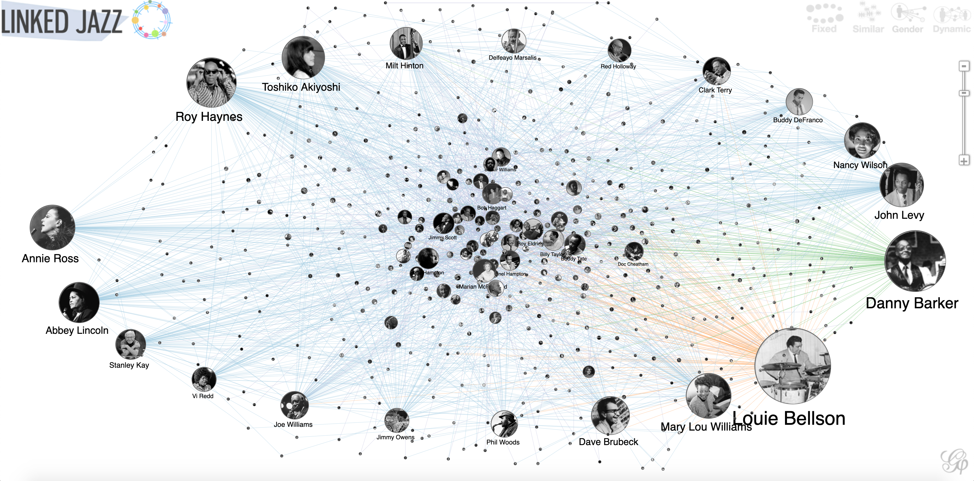
Linked Jazz Network Graph
This interactive graph shows some of the famous names in jazz and how they influenced other artists.
For more visualizations, check out the d3 gallery on GitHub. d3/d3 Bring data to life with SVG, Canvas and HTML. :bar_chart::chart_with_upwards_trend::tada: – d3/d3 github.com
Final Comments
For those of you who are interested in seeing more visualizations, I have multiple references below to books and websites that may be of interest to you if you are serious about developing your visualization skills, be they in the form of visual thinking or in developing interactive visualizations using D3.
As a way to reward you for sticking through this article, here is the visualization that was selected as the winner of the “Information is Beautiful Award 2018”. This visualization renames subway stations in London after the Instagram hashtag that is most often associated with that location.
I leave you with a link to a fun website that has some fascinating and funny examples of poor visualizations. Some of the visualizations used in this article were obtained from this website. WTF Visualizations Visualizations that make no sense. For a discussion of what is wrong with a particular visualization, tweet at us…viz.wtf
Thank you for reading!
Further Reading
Further Reading
This section contains a list of useful resources that focus on the creation of data visualizations.
Books
[1] Visual Thinking for Design, Colin Ware, Morgan Kaufman (2008)
[2] Interactive Data Visualization for the Web, Scott Murray, O’Reilly (2017)
[3] Visualization Analysis and Design, Tamara Munzner, CRC Press (2014)
[4] The Functional Art: An introduction to information graphics and visualization, Alberto Cairo, New Riders (2012)
[5] Design for Information, Isabel Meirelles, Rockport (2013)
Edward Tufte
D3
D3.js is a JavaScript library for manipulating documents based on data. D3 helps you bring data to life using HTML, SVG, and CSS.
[1] Official D3 Site [2] Official D3 API reference (version 4) [3] Official D3 API reference (version 3.x) [4] D3 Tutorial by Scott Murray (D3 version 3) [5] Jerome Cukier’s D3 Cheat Sheet
Web Development
[1] WebStorm by JetBrains — Smart JavaScript IDE (free for students). [2] Eloquent Javascript Book [3] DevDocs, Mozilla Developer Network — Unified documentations on major web technologies. [4] Github (Git repository hosting service) — Version control system for software development. (free private repositories for students)
Tableau
Tableau Software is a tool that lets you create interactive data visualizations. (free for students)
Data Sources
Web Sites & Blogs
Other Software Toolkits
Plot.ly Wolfram Mathematica Prefuse (Java)


