Ready to learn Data Science? Browse courses like Data Science Training and Certification developed by industry thought leaders and Experfy in Harvard Innovation Lab.

The “usability of data” is an area that is ripe for improvement and development. After all, it takes people to use data in order for it to have any value. My doctoral research showed the use of data in decision making is an area that needs a lot more investment.
Enter Data Science as a Platform, or DSaaP (pronounced dee-sap) — a one-stop-shop of curated insights, KPIs and knowledge specifically tailored for each business manager.
DSaaP’s offer the opportunity to bring together a great User Experience (UX) with holistic insights on-demand. Business managers would log into the tool just like they do emails each day and use the DSaaP as a regular part of their job.
What might DSaaP look like? How would it work?
I image several things when I talk about DSaaP. The first is a login screen linked with a business user system like Active Directory. This is to make sure the DSaaP can be maintained centrally by the IT folks and not as a standalone tool. See diagram 1 below.
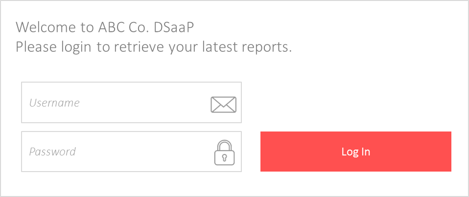
Diagram 1: DSaaP login mock-up
After logging into the DSaaP system, the user is presented with widgets. Each widget is a dashboard and the user only sees the dashboards relevant to their projects and group initiatives.
For example, a marketing director in charge of digital channels might have a social media dashboard, an online media spend dashboard and their marketing group KPI dashboard. See diagram 2 below.
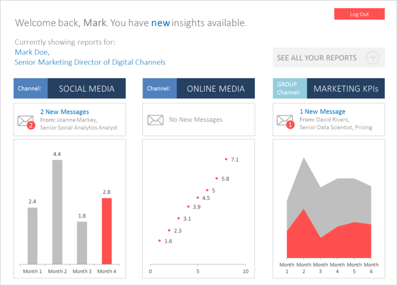
Diagram 2: DSaaP homepage mock-up showing different dashboard widgets
All of the widgets would be interchangeable and dynamic. They would be controlled by both the user and the analysts. The user decides which data is most important, therefore determining the widgets that appear on the home screen.
The analysts are responsible for maintaining the underlying dashboards and proactively sending messages to the user about any new insights, alerts or important bits of information via the DSaaP system.
The underlying architecture for a DSaaP system shows how the interchange of data could work. See diagram 3, below.
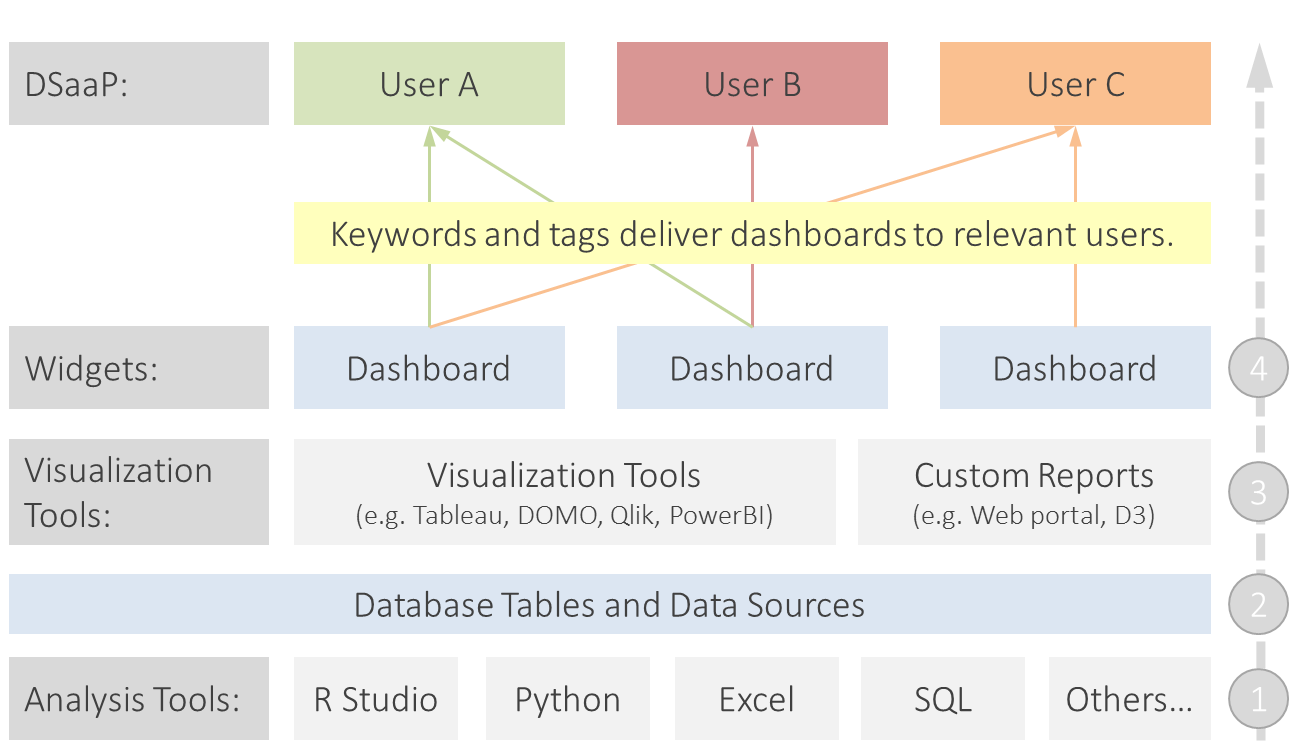
Diagram 3: DSaaP architecture example
The DSaaP system essentially starts with the analysis (step 1 in diagram 3). The data scientists and analysts use the different tools to run models, perform analysis projects and set up the underlying data that will eventually be needed by the dashboard widgets.
That data is then saved to tables or data sources in the business environment (step 2 in diagram 3).
From there, the analysts create the data visualizations and dashboards that will be shown to the end users (step 3 in diagram 3). These can be custom builds in web apps, for example, or in visualization tools like Tableau, Qlik, DOMO or PowerBI.
The location and type of visualization depends on the dashboard subject. Each dashboard is categorized or tagged with keywords which will be used by DSaaP to filter the widgets displayed to each user.
For example, Mark Doe, Senior Marketing Director of Digital Channels may be get dashboards tagged with ‘social media’, ‘digital ad performance’ and ‘digital marketing analytics’.
The analyst then publishes the dashboards (step 4 in diagram 3) to the DSaaP system which are then displayed to the user when they login to the portal.
Finally, how would DSaaP aid decision making?
DSaaP provides a number of benefits toward the “usability of data.” Some of the benefits are listed below but ultimately it comes down to three things: holistic insights for each business leader, engaging user experience and a centralized tool.
Top Benefits of DSaaP
- Provides a tool for accessing insights that is curated by a specialist, thus limiting subjective biases in accessing data
- Houses holistic insights in one location, enabling analysts to bring together all of the data sources and data insights in one place so the business manager spends less time digesting insights from different teams
- Encourages data use through a great user interface — UX is the heart of the DSaaP and a smart user-centered UX means managers are more likely to use the tool to gather the information they need to make a decision
- Gives a single source of truth — insights are delivered in one place, eliminating the duplication of work and building confidence in the data
- Works with any visualization tool — DSaaP is widget-based with dashboards collected via APIs or embedded into parts of the interface based on the best data visualization tool for each section such as Qlik, Tableau, Domo or a custom visualization
- Helps eliminate data silos, building toward a central tool naturally helps eliminate data silos with analysts forced to think about the common platform. It also means that the location of underlying data is less important and data lakes or relational databases can all feed into the DSaaP
DSaaP thinking has already started in tools like Qlik, Tableau and DOMO but they only represent part of the solution. These tools visualize data well but are cumbersome to scale across the enterprise and don’t provide the necessary functions to cover all data sources. DSaaP needs to be broader and have the ability to cover all use-cases, pulling in visualizations from Tableau, DOMO or any other tool as well as custom visualizations built by programs like R, Python or JavaScript, for example.
We now have all the parts needed to develop DSaaP. Machine learning, APIs, web-enabled apps and data visualization have all reached a point where DSaaP can and should now be a reality. The benefits of developing DSaaP for decision making are compelling and, encouragingly, a number of innovative businesses are already on the journey of creating working versions of DSaaP.


