Ready to learn Data Science? Browse courses like Effective Data Visualization developed by industry thought leaders and Experfy in Harvard Innovation Lab.
This is a write up of my keynote from the 2018 Tapestry Conference (above). You can see the slides (from which I’ve derived many of the images below) with speaker notes here.
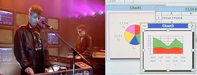
Imagine what it was like to do data visualization 30 years ago. It’s 1988 and you’re using Excel 2.0 for simple charts like pie charts and line charts, or maybe something like SPSS for more complicated exploration and Arc/Info for geospatial data visualization. Some chart types that have become rather ubiquitous, like the treemap, haven’t even been invented yet. But in 1988, Edward Tufte’s The Visual Display of Quantitative Information was already five years old.

Footage of analysts operating Excel 2.0 to make pie charts c. 1988
Now, imagine what it was like to make data visualization 15 years ago. There was no D3, no Tableau, no ggplot or even Prefuse/Flare. If you wanted to do network visualization you might use the newly published Cytoscape though it was focused on bioinformatics. Geospatial options were more advanced, with ArcGIS providing more and more cartographic functionality in its many red toolboxes.
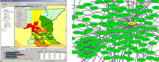
The difference in the traditions backing geospatial data visualization and network data visualization: in 2003 it was already version 8.0 of ArcGIS whereas that same year saw the release of the first modern network data visualization tool: Cytoscape.
I know how much the data visualization has changed because I spent the last ten years or so making data visualization products in one form or another. Big public-facing work like ORBIS and Kindred Britain as well as less public data visualization for fun or to support research, analysis and exploration. Along with practical work making data visualization, I wrote a book about the most powerful data visualization library in the world today: D3. And then I wrote that book again. For the last year I’ve been building out my own charting library, Semiotic. I’ve also been running an annual survey of data visualization professionals for the last two years. And along the way I’ve written about data visualization here on Medium.
That’s not why I was invited to give a keynote at Tapestry. I was invited because I make incendiary comments on social media and in interviews and occasionally in talks. I have long said that we should be more comfortable with critique in data visualization but without context the remarks I make might seem arbitrary and mean-spirited.
So I was happy to have this opportunity to give context and express my concern that there has been a convergence of tools and modes but no corresponding reorganization of thought and practice. It seems like we’re still talking about and evaluating data visualization as if it was 1988 or 2003 when the number of people doing data visualization, the capabilities of their tools and the expectations of their audiences has dramatically increased.
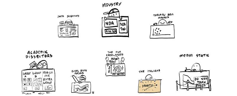
We continue to split the data visualization community into old categories like analysts using BI tools to create reports, developers using code to make custom data visualization, journalists creating data-driven stories or data scientists leveraging exploratory data analysis. Within or between those groups we have data artists, professional scientists, business analysts and toolmakers of the kind we might see immortalized in the cartoons of Susie Lu. These categories of practice map directly to particular tools and modes that have, as of late, begun to transform.
1st Wave: Clarity
And so I’d like to offer up that there was, in the modern sense of data visualization, a 1st wave centered on Edward Tufte that emphasized clarity, simplicity and direct 1-to-1 mapping of data points avoiding as much transformation as possible. From this era we see the rise of spartan color schemes — often focused on neutral or desaturated colors with one standout color — the importance of labels and natural language titles, and a sort of idealization of the perfect chart that is immediately readable, accessible and actionable. A sort of chart-as-sentence with clear structures and rules like you might see in The Elements of Style.

Wave 1: Clarity
2nd Wave: Systems
The 2nd wave focused on systematizing the encoding of information necessary for the development of tooling to produce data visualization. It is centered on the most influential work on this subject: The Grammar of Graphics by Leland Wilkinson. Instead of the chart as a linguistic analogy, it is the chart as an extrusion from a valid specification. The Grammar of Graphics aspired to enable people to create an ensemble of graphics and if we take a look at any data visualization library, my own included, and see that philosophy in action.
These tools and libraries advertise massive amounts of examples and gone is the careful use of color and text, replaced with a love letter to geometry. The entire “for example” approach is so ingrained in these tools that Mike Bostock wrote an entire piece on it.
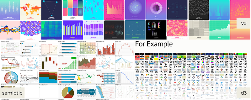
Wave 2: Systems
D3, like all the tooling from this period, is directly inspired by or heavily influenced by The Grammar of Graphics. Semiotic, Victory, Highcharts, Plotly: All of these come from or are themselves highly influenced by D3. The two g’s in Grammar of Graphics is where ggplot gets its name. Leland Wilkinson, the author, was a Principal Research Scientist at Tableau. The grammar of graphics focuses in a razor-sharp way on encoding data via channels onto geometry. This is a system for encoding graphics from data, where the data attributes correspond and dynamically affect the length, angle, color or position (or any other graphical character) based on the data and changes in the data.
Wave 2 was about taking these theoretical systems and producing the tools necessary for any data visualization practitioner to create any graphical expression based on data. That’s great for engineers and software architects trying to build libraries to allow for data visualization, but not necessarily for practitioners creating data visualization products. That’s why we’ve seen such a proliferation of tools and libraries for data visualization but a concurrent rise in hideous graphics posing as charts.
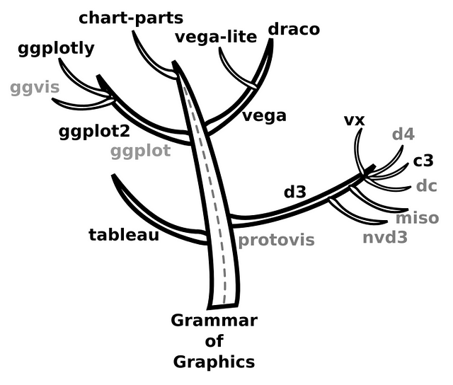
The search for a perfect specification for encoding data attributes through graphical channels is a means to an end. But the power and success of the systems built during this period became an ends to themselves, which runs afoul of a basic precept of The Grammar of Graphics:
This system is capable of producing some hideous graphics. … This system cannot produce a meaningless graphic, however.
By this, Wilkinson means that there’s a logical relationship between the graphics and the data but just because graphics have some kind of “recipe” does not mean it’s somehow “not meaningless”. Data visualization is a form of communication and if you produce hideous charts that means they are illegible and that means they are meaningless.
Data visualization is a form of communication and if you produce hideous charts that means they are illegible and that means they are meaningless.
2nd Wave Data visualization, with its lack of emphasis on design in favor of systems produced a forest of horrible dashboards and reports. Every engineering department in every company has at least one ugly realtime chart written with some framework built on D3. Every executive has a dozen tableau dashboards filled with tabs and views of the same 10-color desaturated line charts. We see screenshots from what is ostensibly exploratory data analysis dropped into documents or integrated into dashboards without any sense of optimization. All of this happens in spite of the growing feature parity across technologies.
3rd Wave: Convergence
We are in desperate need of reevaluating and renaming our modes. 5 or 10 years ago, what kind of data visualization you made — whether it was a dashboard, a notebook, a report or a bespoke communications piece — was very different depending on the language, library or tool you were using. That’s no longer the case.
We need to imagine new approaches which acknowledge that convergence isn’t just happening in the capabilities of tools but also in the expectation of users who no longer are willing to accept that they need to exit out of one mode to optimize for another. That entails shifting our emphasis away from individual charts to the construction, evaluation and delivery of the products where those charts appear.

The nteract notebook platform advertises itself not only to traditional notebook users (researchers and data scientists) but to a broad audience interested in more than just
Notebooks are becoming more dashboard-like, dashboards are becoming more storytelling-like and in general there’s a growing cross-pollination and convergence amongst media/modes. You can make beautiful graphics with R, you can have hierarchical charts in Tableau, you can easily deploy email reports from your custom dashboard.

At Netflix, we’re experimenting with analytical notebooks designed not for exploratory data analysis but explanatory data visualization and the collaborative and communication needs required in that mode. Storytelling techniques common to data journalism are top-of-mind to stakeholders who have grown sophisticated in their tastes and expect cued animation and personalized frames of reference.
There are more and more of these trends that we need to better understand:
- Once esoteric chart types, like treemaps and node-link diagrams, are now so accessible that they appear everywhere, and now it takes a really weird chart to be declared a xenografic.
- Notebooks are being used as dashboards and also as artifacts in the data engineering and transformation process.
- Data visualization in R has grown nearly as robust and interactive as data visualization in BI tools or custom applications.
- People are growing more comfortable with stylized data visualization (sketchy but also ISOTYPE).
Where are we headed?
These factors all contribute to what I think will define a third wave of data visualization where modes like notebooks, dashboards and long-form storytelling converge, as will the tools to create them and the literacy of the audiences they are made for. This has been happening for some time and we’ve reacted to it, but I think it’s time to actively consider what this means.
Clickbait Charts
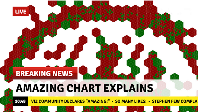
That requires us to move away from the expectation that we are making isolated charts optimized for immediate readability. We currently evaluate and celebrate data visualization that is designed and optimized for a single visit. That’s fine but we need to also promote and evaluate and better understand data visualization designed and optimized for multiple visits. UI & UX need to be first-class concerns and interactivity can’t just be an attribute of the geometry. To do this, we need to move away from the model of the isolated genius creating bespoke data visualization and bring in best practices from collaborative projects common to the larger software development community.
Foster Critique
It’s easy to belittle some 3D pie chart or the latest “amazing map”. That may seem to be how the last point was positioned but it’s not, it’s an attempt to push us into being able to not only celebrate what’s great about data visualization but also speak honestly what’s bad. We need to do more of that if we want to move forward as a community. But criticism is hard — hard to hear and hard to give well.
Part of the reason we’re so bad at giving, taking and fostering critique is that data visualization has long been an individualistic pursuit. The other reason we’re not so great at critique is that ours is a community of celebration. But celebration is not a wholly positive act when it sections off and exoticizes powerful mechanisms to advance communication through the implication that they’re only available to journalists or freelancers.
Partly, I think this has to do with our emphasis on individual channels in the academic literature. We’re very comfortable critiquing pie charts because we know that angles are bad at encoding value. But we lack guidelines for how to evaluate more holistically, so that we’re unable to explain why some encoding choices, though not optimal in isolation, might prove valuable in practice. We also don’t know how to evaluate appeal, so we lack the language or structure to explain why people like sized circles in beeswarm plots and graduated symbol plots as easily as we can explain why circles are a bad choice for encoding value.
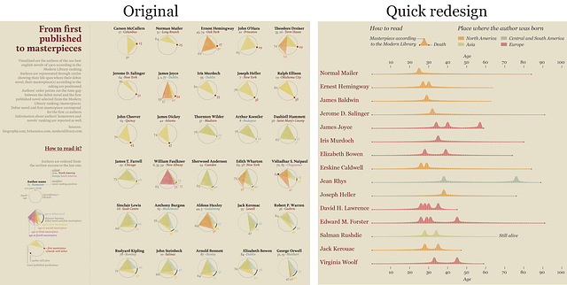
Redesign of Giorgia Lupi’s chart by Alberto Cairo from The Functional Art.
Another reason why we’re not great at critique is that we have this very prominent model of criticism (championed by Alberto Cairo as well as Fernanda Viegas & Martin Wattenberg) that implies the best way to critique a viz is to remake it. While this is a valuable approach, it is so expensive in labor and intellectual investment that it makes it naturally less common than simply pointing out things that aren’t working in a data visualization product. Along with this approach, we need to promote and grow our comfort level with less involved forms of criticism.
We can’t just do this by writing a bunch of think pieces about critique, though it would be nice to have a few taxonomies of criticism like we have taxonomies of charts. We need to actively work to develop our community to be a place to give, receive and model critical discourse. Ben Jones’ recent piece about building a healthy data visualization community provides some good guidance based on real world experience that we should all follow.
Understand Design

Some design-related results of the 2018 data visualization survey.
Survey responses and conversation indicate design is an important theme to improving data visualization practice. But practitioners have expressed confusion as to what design means. Do we mean graphic design? UI design? General design thinking concepts? Information design? There’s a lack of meaty design approaches in data visualization that can be taught and learned by early career professionals.

Delightful colors and gifs like those found in Nadieh Bremer’s Dragonball Z data visualization or simple hacks like the line break in “everywhere” are tricks we might feel art dirty but can prove critical to drawing users into reading and interacting with your data visualization product.
Embrace the Attention Economy
I think that the day of ‘eye-consciousness’ is rapidly approaching.
– Otto Neurath
When I first came to Netflix from Stanford, I thought naively that because it was a business then employees would be forced to use and learn the data visualization I made. I found out quickly that was not the case. Netflix’s own culture was against such dictatorial measures but even more, my stakeholders were trying to make critical decisions and my data visualization products were competing with a dozen or more other dashboards and reports.
As a result, the work we’re doing internally at Netflix leverages images, gifs, playful color and novel visual methods to delight users. While the general prohibition against chartjunk is a good rule, like all things it can be applied too strictly. A more decorative approach that acknowledges the existence of an attention economy even in a data-driven organization will result in more effective data visualization.
New Blood
We have already gone through one messy period where our community felt the need to radically distance itself from older leadership, to the point that being blocked on Twitter by Edward Tufte has become a sort of rite of passage. We shouldn’t have to do that to hear and amplify new voices. We need to identify and actively promote new voices in data visualization leadership.
Who are leaders for a 3rd wave data visualization? Who is taking advantage of the new opportunities presented by the convergence of modes, audiences and tools? What does that new work look like? Is it notebooks with features of dashboards and data-driven storytelling like Krist Wongsuphasawat’s Boba Science? Is it new approaches to charting tools like Charticulator? Or the use of R to make data visualization graphics for the news, like that seen in the work of John Burn-Murdoch? Or the Giorgia Lupi style dataviz in Tableau like Neil Richards has done? Or is it the fuzzy boundary between data visualization, marginalia, cartoon and text seen in RJ Andrews’ INFO WE TRUST? Or is it the amazing hand-drawn approach of Mona Chalabi? Or is it something else?
One thing is for sure, we have examples of those who have optimized for past best practices, now we need those who epitomize a new wave of data visualization.
