A tutorial for understanding and correcting class imbalances
Balance within the imbalance to balance what’s imbalanced
— Amadou Jarou Bah
Disclaimer: This is a comprehensive tutorial on handling imbalanced datasets. Whilst these approaches remain valid for multiclass classification, the main focus of this article will be on binary classification for simplicity.
Introduction
As any seasoned data scientist or statistician will be aware of, datasets are rarely distributed evenly across attributes of interest. Let’s imagine we are tasked with discovering fraudulent credit card transactions — naturally, the vast majority of these transactions will be legitimate, and only a very small proportion will be fraudulent. Similarly, if we are testing individuals for cancer, or for the presence of a virus (COVID-19 included), the positive rate will (hopefully) be only a small fraction of those tested. More examples include:
- An e-commerce company predicting which users will buy items on their platform
- A manufacturing company analyzing produced materials for defects
- Spam email filtering trying to differentiation ‘ham’ from ‘spam’
- Intrusion detection systems examining network traffic for malware signatures or atypical port activity
- Companies predicting churn rates amongst their customers
- Number of clients who closed a specific account in a bank or financial organization
- Prediction of telecommunications equipment failures
- Detection of oil spills from satellite images
- Insurance risk modeling
- Hardware fault detection
One has usually much fewer datapoints from the adverse class. This is unfortunate as we care a lot about avoiding misclassifying elements of this class.
In actual fact, it is pretty rare to have perfectly balanced data in classification tasks. Oftentimes the items we are interested in analyzing are inherently ‘rare’ events for the very reason that they are rare and hence difficult to predict. This presents a curious problem for aspiring data scientists since many data science programs do not properly address how to handle imbalanced datasets given their prevalence in industry.
When does a dataset become ‘imbalanced’?
The notion of an imbalanced dataset is a somewhat vague one. Generally, a dataset for binary classification with a 49–51 split between the two variables would not be considered imbalanced. However, if we have a dataset with a 90–10 split, it seems obvious to us that this is an imbalanced dataset. Clearly, the boundary for imbalanced data lies somewhere between these two extremes.
In some sense, the term ‘imbalanced’ is a subjective one and it is left to the discretion of the data scientist. In general, a dataset is considered to be imbalanced when standard classification algorithms — which are inherently biased to the majority class (further details in a previous article) — return suboptimal solutions due to a bias in the majority class. A data scientist may look at a 45–55 split dataset and judge that this is close enough that measures do not need to be taken to correct for the imbalance. However, the more imbalanced the dataset becomes, the greater the need is to correct for this imbalance.
In a concept-learning problem, the data set is said to present a class imbalance if it contains many more examples of one class than the other.
As a result, these classifiers tend to ignore small classes while concentrating on classifying the large ones accurately.
Imagine you are working for Netflix and are tasked with determining which customer churn rates (a customer ‘churning’ means they will stop using your services or using your products).
In an ideal world (at least for the data scientist), our training and testing datasets would be close to fully balanced, having around 50% of the dataset containing individuals that will churn and 50% who will not. In this case, a 90% accuracy will more or less indicate a 90% accuracy on both the positively and negatively classed groups. Our errors will be evenly split across both groups. In addition, we have roughly the same number of points in both classes, which from the law of large numbers tells us reduces the overall variance in the class. This is great for us, accuracy is an informative metric in this situation and we can continue with our analysis unimpeded.
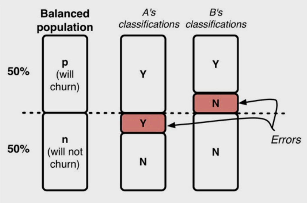
As you may have suspected, most people that already pay for Netflix don’t have a 50% chance of stopping their subscription every month. In fact, the percentage of people that will churn is rather small, closer to a 90–10 split. How does the presence of this dataset imbalance complicate matters?
Assuming a 90–10 split, we now have a very different data story to tell. Giving this data to an algorithm without any further consideration will likely result in an accuracy close to 90%. This seems pretty good, right? It’s about the same as what we got previously. If you try putting this model into production your boss will probably not be so happy.
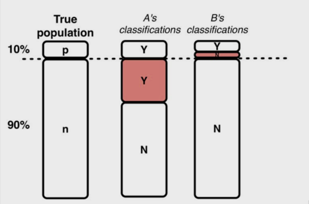
Given the prevalence of the majority class (the 90% class), our algorithm will likely regress to a prediction of the majority class. The algorithm can pretty closely maximize its accuracy (our scoring metric of choice) by arbitrarily predicting that the majority class occurs every time. This is a trivial result and provides close to zero predictive power.
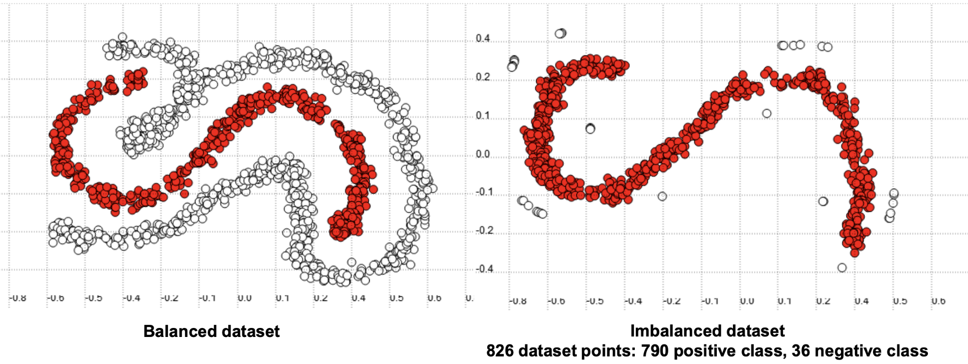
Predictive accuracy, a popular choice for evaluating the performance of a classifier, might not be appropriate when the data is imbalanced and/or the costs of different errors vary markedly.
Visually, this dataset might look something like this:
Machine learning algorithms by default assume that data is balanced. In classification, this corresponds to a comparative number of instances of each class. Classifiers learn better from a balanced distribution. It is up to the data scientist to correct for imbalances, which can be done in multiple ways.
Different Types of Imbalance
We have clearly shown that imbalanced datasets have some additional challenges to standard datasets. To further complicate matters, there are different types of imbalance that can occur in a dataset.
(1) Between-Class
A between-class imbalance occurs when there is an imbalance in the number of data points contained within each class. An example of this is shown below:

An example of this would be a mammography dataset, which uses images known as mammograms to predict breast cancer. Consider the number of mammograms related to positive and negative cancer diagnoses:

Note that given enough data samples in both classes the accuracy will improve as the sampling distribution is more representative of the data distribution, but by virtue of the law of large numbers, the majority class will have inherently better representation than the minority class.
(2) Within-Class
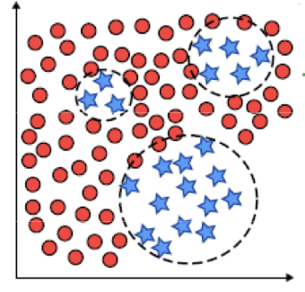
A within-class imbalance occurs when the dataset has balanced between-class data but one of the classes is not representative in some regions. An example of this is shown below:
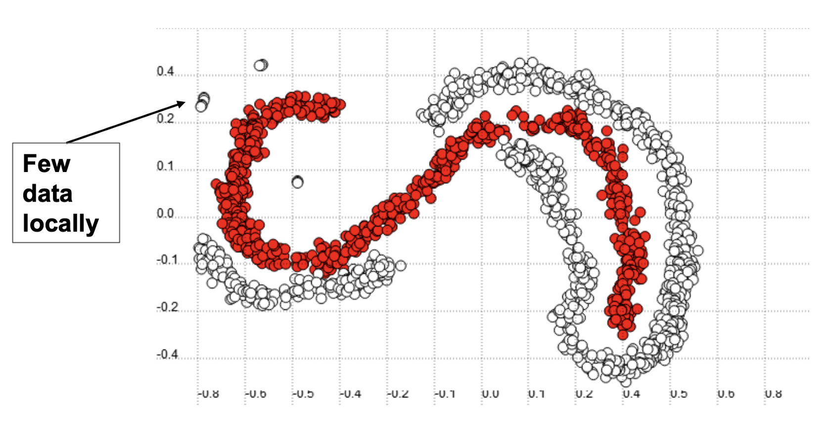
(3) Intrinsic and Extrinsic
An intrinsic imbalance is due to the nature of the dataset, while extrinsic imbalance is related to time, storage, and other factors that limit the dataset or the data analysis. Intrinsic characteristics are relatively simple and are what we commonly see, but extrinsic imbalance can exist separately and can also work to increase the imbalance of a dataset.
For example, companies often use intrusion detection systems that analyze packets of data sent in and out of networks in order to detect malware of malicious activity. Depending on whether you analyze all data or just data sent through specific ports or specific devices, this will significantly influence the imbalance of the dataset (most network traffic is likely legitimate). Similarly, if log files or data packets related to suspected malicious behavior are commonly stored but normal log are not (or only a select few types are stored), then this can also influence the imbalance of the dataset. Similarly, if logs were only stored during a normal working day (say, 9–5 PM) instead of 24 hours, this will also affect the imbalance.
Further Complication of Imbalance
There are a couple more difficulties increased by imbalanced datasets. Firstly, we have class overlapping. This is not always a problem, but can often arise in imbalanced learning problems and cause headaches. Class overlapping is illustrated in the below dataset.
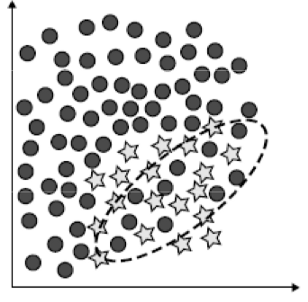
Class overlapping occurs in normal classification problems, so what is the additional issue here? Well, the class more represented in overlap regions tends to be better classified by methods based on global learning (on the full dataset). This is because the algorithm is able to get a more informed picture of the data distribution of the majority class.
In contrast, the class less represented in such regions tends to be better classified by local methods. If we take k-NN as an example, as the value of k increases, it becomes increasingly global and increasingly local. It can be shown that performance for low values of k has better performance on the minority dataset, and lower performance at high values of k. This shift in accuracy is not exhibited for the majority class because it is well-represented at all points.
This suggests that local methods may be better suited for studying the minority class. One method to correct for this is the CBO Method. The CBO Method uses cluster-based resampling to identify ‘rare’ cases and resample them individually, so as to avoid the creation of small disjuncts in the learned hypothesis. This is a method of oversampling — a topic that we will discuss in detail in the following section.
Correcting Dataset Imbalance
There are several techniques to control for dataset imbalance. There are two main types of techniques to handle imbalanced datasets: sampling methods, and cost-sensitive methods.
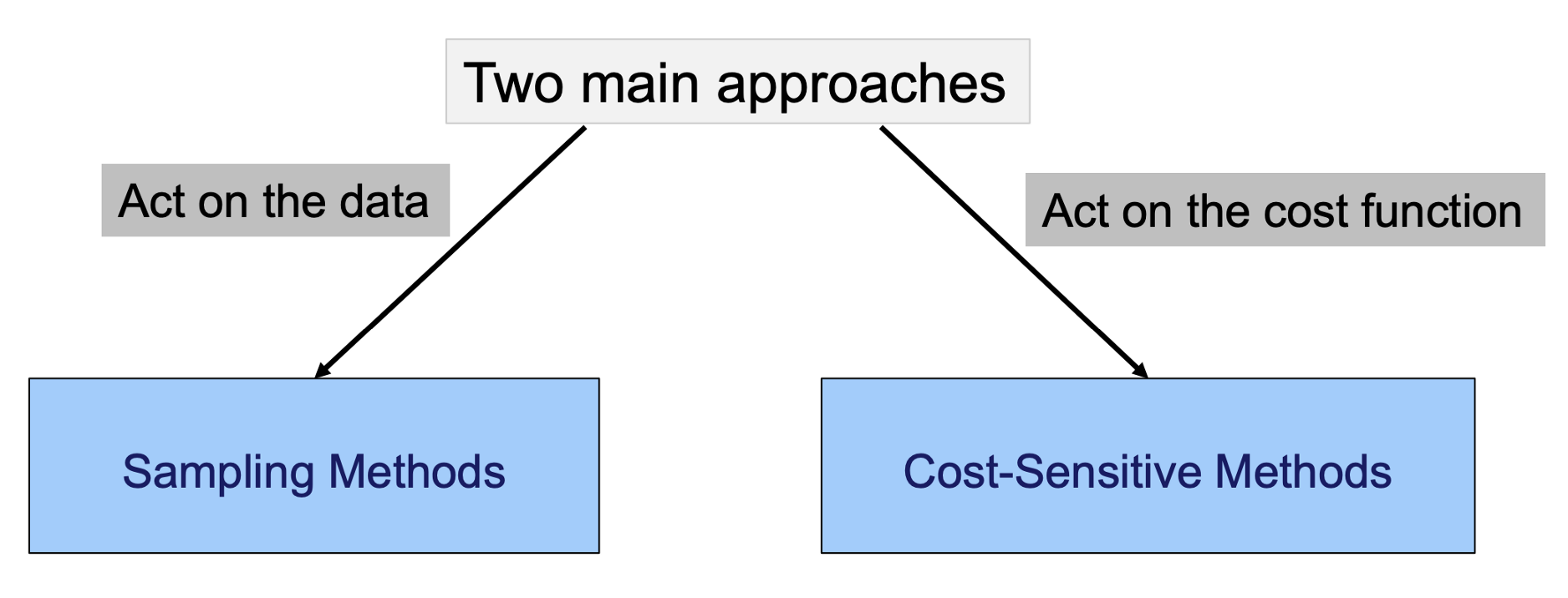
The simplest and most commonly used of these are sampling methods called oversampling and undersampling, which we will go into more detail on.
Oversampling/Undersampling
Simply stated, oversampling involves generating new data points for the minority class, and undersampling involves removing data points from the majority class. This acts to somewhat reduce the extent of the imbalance in the dataset.
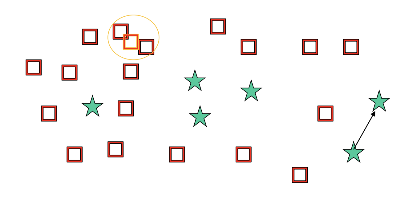
What does undersampling look like? We continually remove like-samples in close proximity until both classes have the same number of data points.
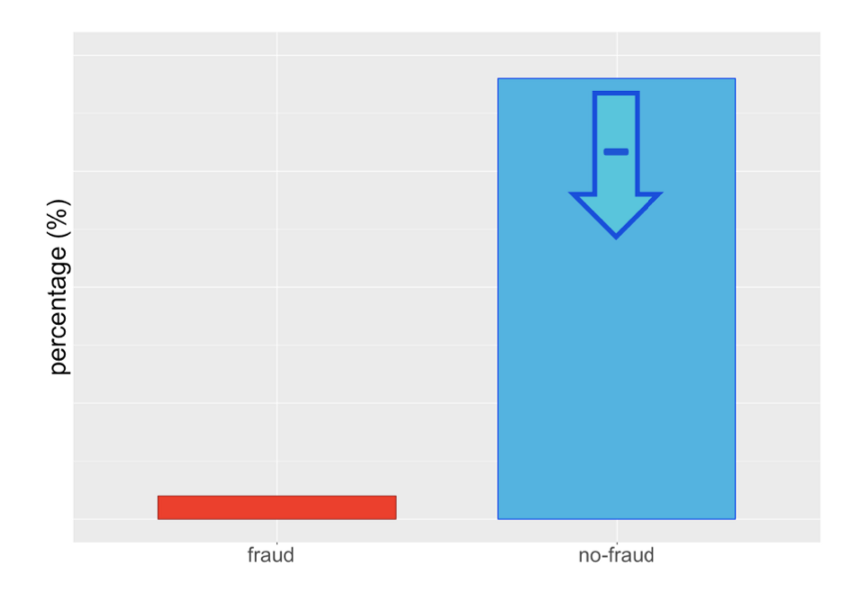
Is undersampling a good idea? Undersampling is recommended by many statistical researchers but is only good if enough data points are available on the undersampled class. Also, since the majority class will end up with the same number of points as the minority class, the statistical properties of the distributions will become ‘looser’ in a sense. However, we have not artificially distorted the data distribution with this method by adding in artificial data points.
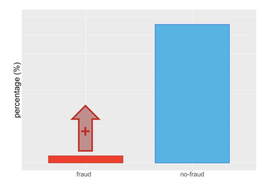
What does oversampling look like? In shot, the opposite of undersampling. We are artificially adding data points to our dataset to make the number of instances in each class balanced.
How do we generate these samples? The most common way is to generate points that are close in dataspace proximity to existing samples or are ‘between’ two samples, as illustrated below.
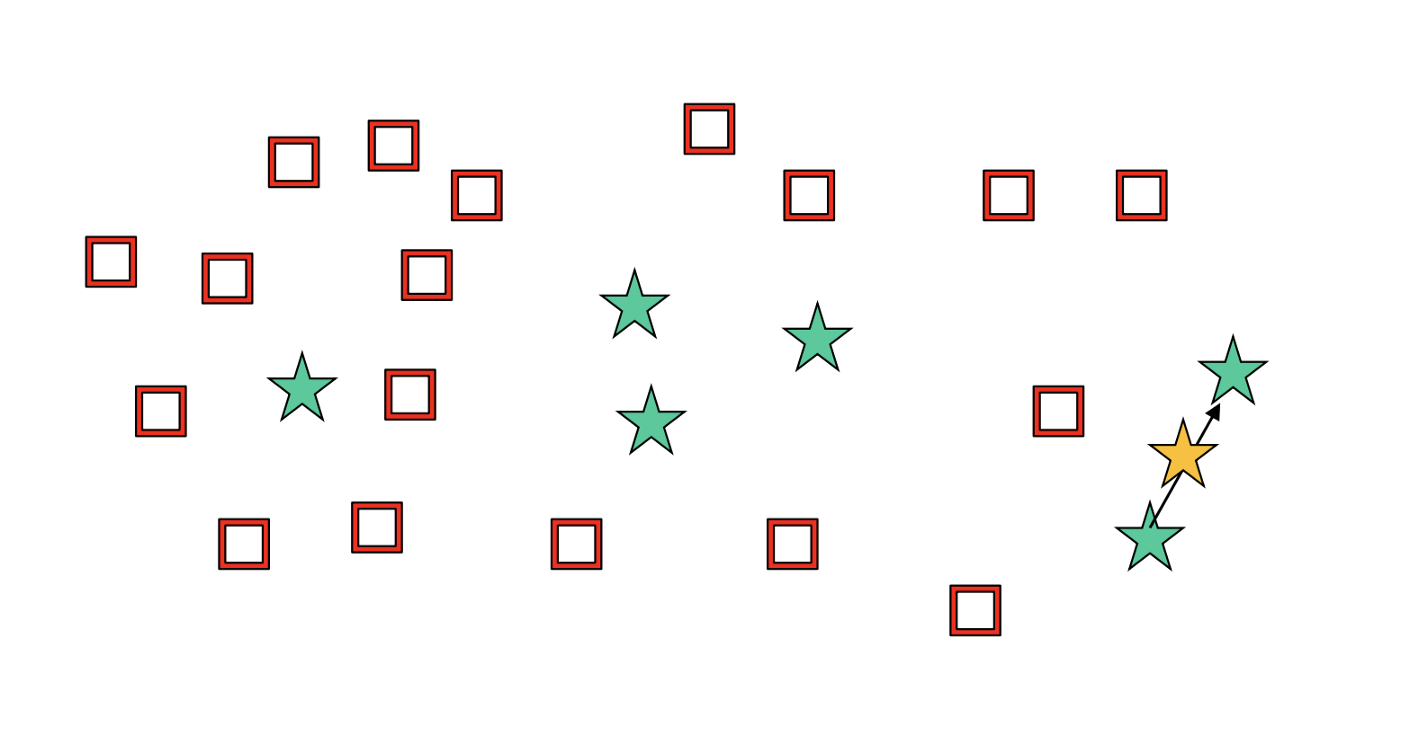
As you may have suspected, there are some downsides to adding false data points. Firstly, you risk overfitting, especially if one does this for points that are noise — you end up exacerbating this noise by adding reinforced measurements. In addition, adding these values randomly can also contribute additional noise to our model.
SMOTE (Synthetic minority oversampling technique)
Luckily for us, we don’t have to write an algorithm for randomly generating data points for the purpose of oversampling. Instead, we can use the SMOTE algorithm.
How does SMOTE work? SMOTE generates new samples in between existing data points based on their local density and their borders with the other class. Not only does it perform oversampling, but can subsequently use cleaning techniques (undersampling, more on this shortly) to remove redundancy in the end. Below is an illustration for how SMOTE works when studying class data.
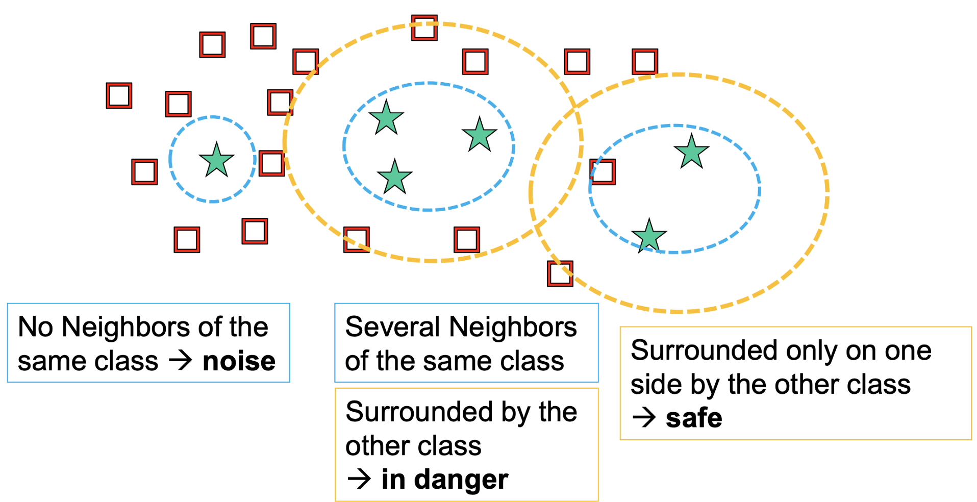
The algorithm for SMOTE is as follows. For each minority sample:
– Find its k-nearest minority neighbours
– Randomly select j of these neighbours
– Randomly generate synthetic samples along the lines joining the minority sample and its j selected neighbours (j depends on the amount of oversampling desired)
Informed vs. Random Oversampling
Using random oversampling (with replacement) of the minority class has the effect of making the decision region for the minority class very specific. In a decision tree, it would cause a new split and often lead to overfitting. SMOTE’s informed oversampling generalizes the decision region for the minority class. As a result, larger and less specific regions are learned, thus, paying attention to minority class samples without causing overfitting.
Drawbacks of SMOTE
Overgeneralization. SMOTE’s procedure can be dangerous since it blindly generalizes the minority area without regard to the majority class. This strategy is particularly problematic in the case of highly skewed class distributions since, in such cases, the minority class is very sparse with respect to the majority class, thus resulting in a greater chance of class mixture.
Inflexibility. The number of synthetic samples generated by SMOTE is fixed in advance, thus not allowing for any flexibility in the re-balancing rate.
Another potential issue is that SMOTE might introduce the artificial minority class examples too deeply in the majority class space. This drawback can be resolved by hybridization: combining SMOTE with undersampling algorithms. One of the most famous of these is Tomek Links. Tomek Links are pairs of instances of opposite classes who are their own nearest neighbors. In other words, they are pairs of opposing instances that are very close together.
Tomek’s algorithm looks for such pairs and removes the majority instance of the pair. The idea is to clarify the border between the minority and majority classes, making the minority region(s) more distinct. Scikit-learn has no built-in modules for doing this, though there are some independent packages (e.g., TomekLink, imbalanced-learn).
Thus, Tomek’s algorithm is an undersampling technique that acts as a data cleaning method for SMOTE to regulate against redundancy. As you may have suspected, there are many additional undersampling techniques that can be combined with SMOTE to perform the same function. A comprehensive list of these functions can be found in the functions section of the imbalanced-learn documentation.
An additional example is Edited Nearest Neighbors (ENN). ENN removes any example whose class label differs from the class of at least two of their neighbor. ENN removes more examples than the Tomek links does and also can remove examples from both classes.
Other more nuanced versions of SMOTE include Borderline SMOTE, SVMSMOTE, and KMeansSMOTE, and more nuanced versions of the undersampling techniques applied in concert with SMOTE are Condensed Nearest Neighbor (CNN), Repeated Edited Nearest Neighbor, and Instance Hardness Threshold.
Cost-Sensitive Learning
We have discussed sampling techniques and are now ready to discuss cost-sensitive learning. In many ways, the two approaches are analogous — the main difference being that in cost-sensitive learning we perform under- and over-sampling by altering the relative weighting of individual samples.
Upweighting. Upweighting is analogous to over-sampling and works by increasing the weight of one of the classes keeping the weight of the other class at one.
Down-weighting. Down-weighting is analogous to under-sampling and works by decreasing the weight of one of the classes keeping the weight of the other class at one.
An example of how this can be performed using sklearn is via the sklearn.utils.class_weight function and applied to any sklearn classifier (and within keras).
from sklearn.utils import class_weight
class_weights = class_weight.compute_class_weight('balanced',                                                  np.unique(y_train), y_train)
model.fit(X_train, y_train, class_weight=class_weights)
In this case, we have set the instances to be ‘balanced’, meaning that we will treat these instances to have balanced weighting based on their relative number of points — this is what I would recommend unless you have a good reason for setting the values yourself. If you have three classes and wanted to weight one of them 10x larger and another 20x larger (because there are 10x and 20x fewer of these points in the dataset than the majority class), then we can rewrite this as:
class_weight = {0: 0.1,
                1: 1.,
                2: 2.}
Some authors claim that cost-sensitive learning is slightly more effective than random or directed over- or under-sampling, although all approaches are helpful, and directed oversampling, is close to cost-sensitive learning in efficacy. Personally, when I am working on a machine learning problem I will use cost-sensitive learning because it is much simpler to implement and communicate to individuals. However, there may be additional aspects of using sampling techniques that provide superior results of which I am not aware.
Assessment Metrics
In this section, I outline several metrics that can be used to analyze the performance of a classifier trained to solve a binary classification problem. These include (1) the confusion matrix, (2) binary classification metrics, (3) the receiver operating characteristic curve, and (4) the precision-recall curve.
Confusion Matrix
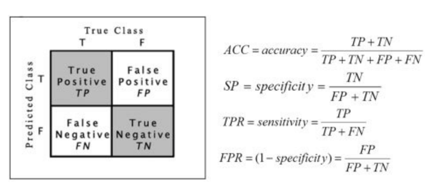
Despite what you may have garnered from its name, a confusion matrix is decidedly confusing. A confusion matrix is the most basic form of assessment of a binary classifier. Given the prediction outputs of our classifier and the true response variable, a confusion matrix tells us how many of our predictions are correct for each class, and how many are incorrect. The confusion matrix provides a simple visualization of the performance of a classifier based on these factors.
Here is an example of a confusion matrix:
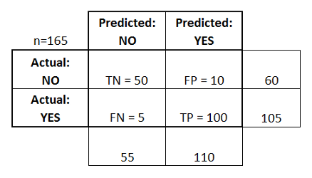
Hopefully what this is showing is relatively clear. The TN cell tells us the number of true positives: the number of positive samples that I predicted were positive.
The TP cell tells us the number of true negatives: the number of negative samples that I predicted were negative.
The FP cell tells us the number of false positives: the number of negative samples that I predicted were positive.
The FN cell tells us the number of false negatives: the number of positive samples that I predicted were positive.
These numbers are very important as they form the basis of the binary classification metrics discussed next.
Binary Classification Metrics
There are a plethora of single-value metrics for binary classification. As such, only a few of the most commonly used ones and their different formulations are presented here, more details can be found on scoring metrics in the sklearn documentation and on their relation to confusion matrices and ROC curves (discussed in the next section) here.
Arguably the most important five metrics for binary classification are: (1) precision, (2) recall, (3) F1 score, (4) accuracy, and (5) specificity.
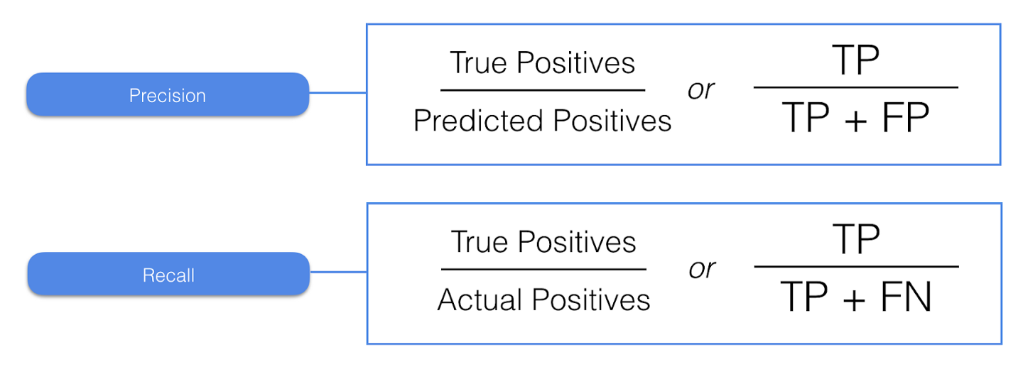
Precision. Precision provides us with the answer to the question “Of all my positive predictions, what proportion of them are correct?”. If you have an algorithm that predicts all of the positive class correctly but also has a large portion of false positives, the precision will be small. It makes sense why this is called precision since it is a measure of how ‘precise’ our predictions are.
Recall. Recall provides us with the answer to a different question “Of all of the positive samples, what proportion did I predict correctly?”. Instead of false positives, we are now interested in false negatives. These are items that our algorithm missed, and are often the most egregious errors (e.g. failing to diagnose something with cancer that actually has cancer, failing to discover malware when it is present, or failing to spot a defective item). The name ‘recall’ also makes sense for this circumstance as we are seeing how many of the samples the algorithm was able to pick up on.
It should be clear that these questions, whilst related, are substantially different to each other. It is possible to have a very high precision and simultaneously have a low recall, and vice versa. For example, if you predicted the majority class every time, you would have 100% recall on the majority class, but you would then get a lot of false positives from the minority class.
One other important point to make is that precision and recall can be determined for each individual class. That is, we can talk about the precision of class A, or the precision of class B, and they will have different values — when doing this, we assume that the class we are interested in is the positive class, regardless of its numeric value.

F1 Score. The F1 score is a single-value metric that combines precision and recall by using the harmonic mean (a fancy type of averaging). The β parameter is a strictly positive value that is used to describe the relative importance of recall to precision. A larger β value puts a higher emphasis on recall than precision, whilst a smaller value puts less emphasis. If the value is 1, precision and recall are treated with equal weighting.
What does a high F1 score mean? It suggests that both the precision and recall have high values — this is good and is what you would hope to see upon generating a well-functioning classification model on an imbalanced dataset. A low value indicates that either precision or recall is low, and maybe a call for concern. Good F1 scores are generally lower than good accuracies (in many situations, an F1 score of 0.5 would be considered pretty good, such as predicting breast cancer from mammograms).
Specificity. Simply stated, specificity is the recall of negative values. It answers the question “Of all of my negative predictions, what proportion of them are correct?”. This may be important in situations where examining the relative proportion of false positives is necessary.
Macro, Micro, and Weighted Scores
This is where things get a little complicated. Anyone who has delved into these metrics on sklearn may have noticed that we can refer to the recall-macro or f1-weighted score.
A macro-F1 score is the average of F1 scores across each class.

This is most useful if we have many classes and we are interested in the average F1 score for each class. If you only care about the F1 score for one class, you probably won’t need a macro-F1 score.
A micro-F1 score takes all of the true positives, false positives, and false negatives from all the classes and calculates the F1 score.

The micro-F1 score is pretty similar in utility to the macro-F1 score as it gives an aggregate performance of a classifier over multiple classes. That being said, they will give different results and understand the underlying difference in that result may be informative for a given application.
A weighted-F1 score is the same as the macro-F1 score, but each of the class-specific F1 scores is scaled by the relative number of samples from that class.

In this case, N refers to the proportion of samples in the dataset belonging to a single class. For class A, where class A is the majority class, this might be equal to 0.8 (80%). The values for B and C might be 0.15 and 0.05, respectively.
For a highly imbalanced dataset, a large weighted-F1 score might be somewhat misleading because it is overly influenced by the majority class.
Other Metrics
Some other metrics that you may see around that can be informative for binary classification (and multiclass classification to some extent) are:
Accuracy. If you are reading this, I would imagine you are already familiar with accuracy, but perhaps not so familiar with the others. Cast in the light of a metric for a confusion matrix, the accuracy can be described as the ratio of true predictions (positive and negative) to the sum of the total number of positive and negative samples.

G-Mean. A less common metric that is somewhat analogous to the F1 score is the G-Mean. This is often cast in two different formulations, the first being the precision-recall g-mean, and the second being the sensitivity-specificity g-mean. They can be used in a similar manner to the F1 score in terms of analyzing algorithmic performance. The precision-recall g-mean can also be referred to as the Fowlkes-Mallows Index.


There are many other metrics that can be used, but most have specialized use cases and offer little additional utility over the metrics described here. Other metrics the reader may be interested in viewing are balanced accuracy, Matthews correlation coefficient, markedness, and informedness.
Receiver Operating Characteristic (ROC) Curve
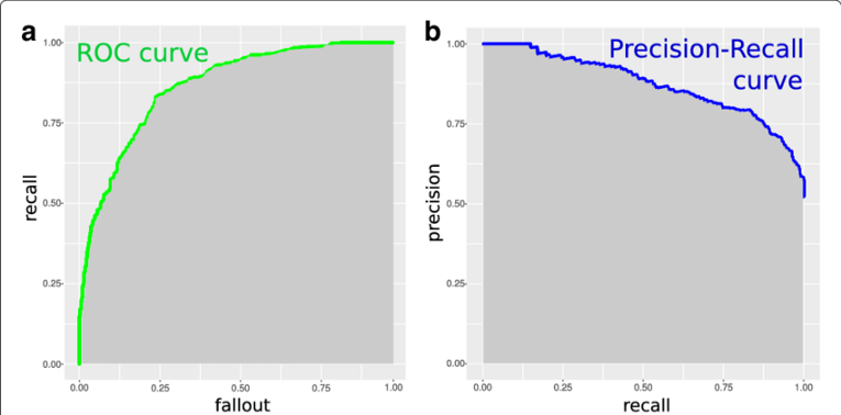
An ROC curve is a two-dimensional graph to depicts trade-offs between benefits (true positives) and costs (false positives). It displays a relation between sensitivity and specificity for a given classifier (binary problems, parameterized classifier or a score classification).
Here is an example of an ROC curve.
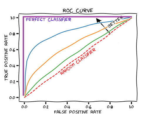
There is a lot to unpack here. Firstly, the dotted line through the center corresponds to a classifier that acts as a ‘coin flip’. That is, it is correct roughly 50% of the time and is the worst possible classifier (we are just guessing). This acts as our baseline, against which we can compare all other classifiers — these classifiers should be closer to the top left corner of the plot since we want high true positive rates in all cases.
It should be noted that an ROC curve does not assess a group of classifiers. Rather, it examines a single classifier over a set of classification thresholds.
What does this mean? It means that for one point, I take my classifier and set the threshold to be 0.3 (30% propensity) and then assess the true positive and false positive rates.
True Positive Rate: Percentage of true positives (to the sum of true positives and false negatives) generated by the combination of a specific classifier and classification threshold.
False Positive Rate: Percentage of false positives (to the sum of false positives and true negatives) generated by the combination of a specific classifier and classification threshold.
This gives me two numbers, which I can then plot on the curve. I then take another threshold, say 0.4, and repeat this process. After doing this for every threshold of interest (perhaps in 0.1, 0.01, or 0.001 increments), we have constructed an ROC curve for this classifier.
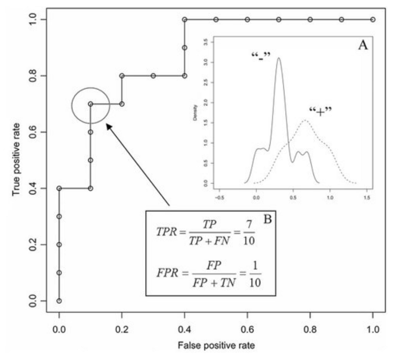
What is the point of doing this? Depending on your application, you may be very averse to false positives as they may be very costly (e.g. launches of nuclear missiles) and thus would like a classifier that has a very low false-positive rate. Conversely, you may not care so much about having a highfalse positive rate as long as you get a high true positive rate (stopping most events of fraud may be worth it even if you have to check many more occurrences that are flagged by the algorithm as flawed). For the optimal balance between these two ratios (where false positives and false negatives are equally costly), we would take the classification threshold which results in the minimum diagonal distance from the top left corner.
Why does the top left corner correspond to the ideal classifier? The ideal point on the ROC curve would be (0,100), that is, all positive examples are classified correctly and no negative examples are misclassified as positive. In a perfect classifier, there would be no misclassification!
Whilst a graph may not seem pretty useful in itself, it is helpful in comparing classifiers. One particular metric, the Area Under Curve (AUC) score, allows us to compare classifiers by comparing the total area underneath the line produced on the ROC curve. For an ideal classifier, the AUC equals 1, since we are multiplying 100% (1.0) true positive rate by 100% (1.0) false-positive rate. If a particular classifier has an ROC of 0.6 and another has an ROC of 0.8, the latter is clearly a better classifier. The AUC has the benefit that it is independent of the decision criteria — the classification threshold — and thus makes it easier to compare these classifiers.
A question may have come to mind now — what if some classifiers are better at lower thresholds and some are better at higher thresholds? This is where the ROC convex hull comes in. The convex hull provides us with a method of identifying potentially optimal classifiers — even though we may not have directly observed them, we can infer their existence. Consider the following diagram:
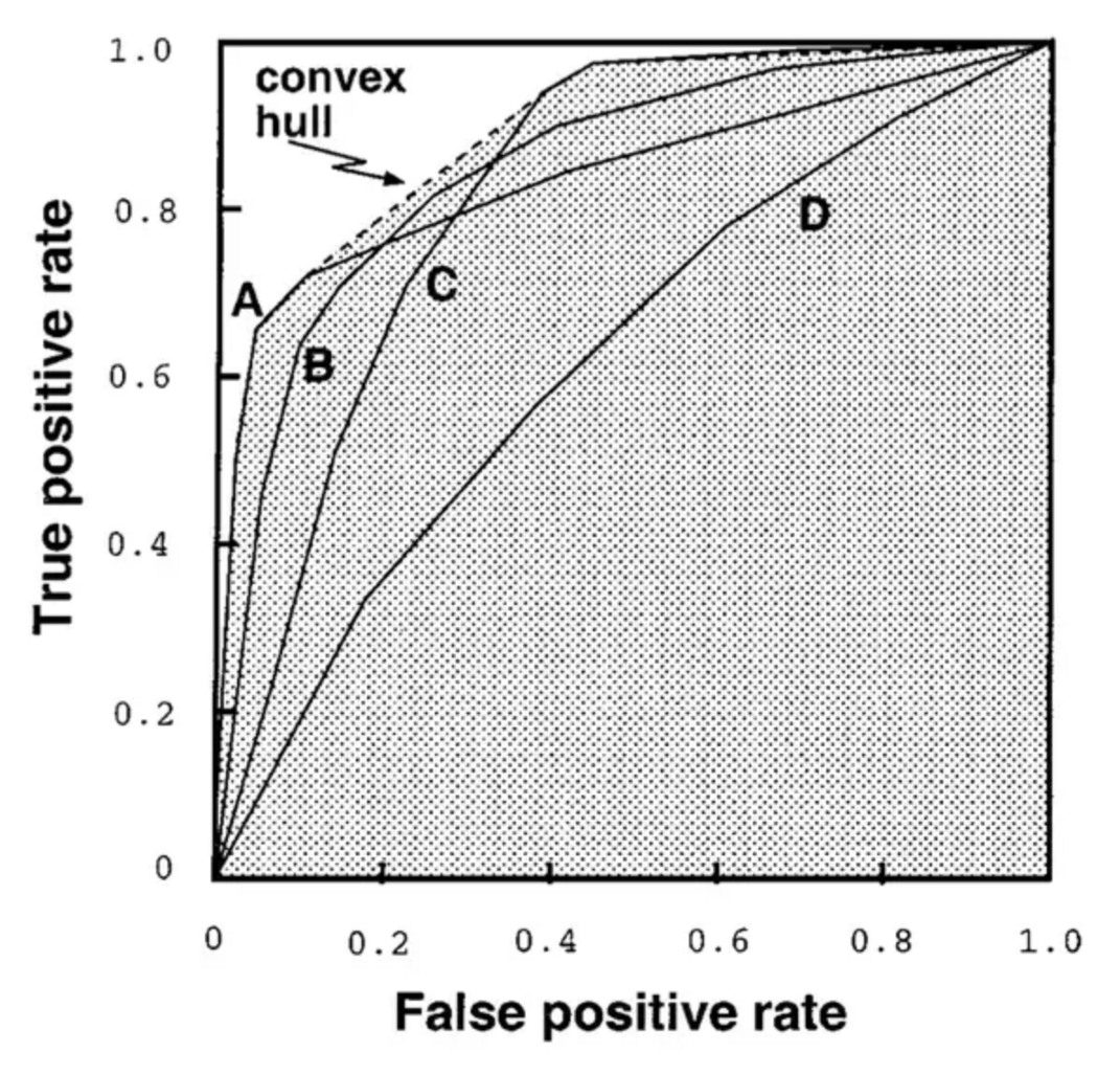
Given a family of ROC curves, the ROC convex hull can include points that are more towards the top left corner (perfect classifier) of the ROC space. If a line passes through a point on the convex hull, then there is no other line with the same slope passing through another point with a larger true positive intercept. Thus, the classifier at that point is optimal under any distribution assumptions in tandem with that slope. This is perhaps easier to understand after examining the image.
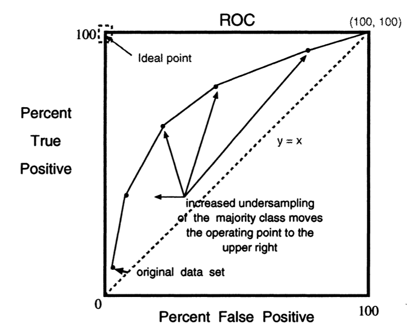
How does undersampling/oversampling influence the ROC curve? A famous paper on SMOTE (discussed previously) titled “SMOTE: Synthetic Minority Over-sampling Technique” outlines that by undersampling the majority class, we force the ROC curve to move up and to the right, and thus has the potential to increase the AUC of a given classifier (this is essentially just validation that SMOTE functions correctly, as expected). Similarly, oversampling the minority class has a similar impact.
Precision-Recall (PR) Curves
An analogous diagram to an ROC curve can be recast from ROC space and reformulated into PR space. These diagrams are in many ways analogous to the ROC curve, but instead of plotting recall against fallout (true positive rate vs. false positive rate), we are instead plotting precision against recall. This produces a somewhat mirror-image (the curve itself will look somewhat different) of the ROC curve in the sense that the top right corner of a PR curve designates the ideal classifier. This can often be more understandable than an ROC curve but provides very similar information. The area under a PR curve is often called mAP and is analogous to the AUC in ROC space.
Final Comments
Imbalanced datasets are underrepresented (no pun intended) in many data science programs contrary to their prevalence and importance in many industrial machine learning applications. It is the job of the data scientist to be able to recognize when a dataset is imbalanced and follow procedures and utilize metrics that allow this imbalance to be sufficiently understood and controlled.
I hope that in the course of reading this article you have learned something about dealing with imbalanced datasets and are in the future will be comfortable in the face of such imbalanced problems. If you are a serious data scientist, it is only a matter of time before one of these applications will pop up!

