Techniques to build Robust, Unbiased AI Applications
Public trust is a vital condition for Artificial Intelligence to be used productively. — Sir Mark Walport

[source]
In the last five years alone, AI researchers have made significant breakthroughs in areas such as image recognition, natural language understanding and board games! As companies are considering handing over critical decisions to AI in industries like healthcare and finance, the lack of understanding of complex machine learned models is hugely problematic. This lack of understanding could result in models propagating bias and we’ve seen quite a few examples of this in criminal justice, politics, retail, facial recognition and language understanding.
All of this has a detrimental effect on trust and this, from my experience, is one of the main reasons why companies are resisting the deployment of AI across the enterprise. Explaining or interpreting AI is a hot topic of research as modern machine learning algorithms are black boxes and nobody really understands how they work. Moreover, there is EU regulation now to explain AI under the GDPR “right to explanation”. In this blog post, I will cover a few techniques that you can add to your data science arsenal to improve model understanding.
Team Data Science Process
But first off, what process do you follow to build and deploy an AI application? At Microsoft, we follow an agile and iterative methodology called the Team Data Science Process (TDSP) that takes inspiration from processes like CRISP-DM and KDD. In this post, I will zoom into the modeling and deployment stages of the process.
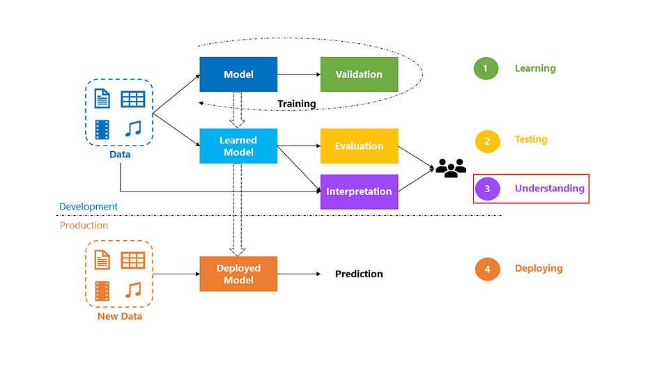
Zooming into Modeling and Deployment in TDSP
When developing the model, the first step is learning. You train a model to detect patterns from historical data and this entails going through multiple iterations of training and validation to pick the best model. Once you have a learned model, the next step is testing. This means evaluating the model on a blind set of data that the model hasn’t seen before. I’ve written a blog post on measuring model goodness and you can apply those techniques to quantify business value and share that with the business stakeholders. After proving business value, the next logical step is typically deploying the model into production. Once deployed, a very common issue is that the model does not perform as expected. There are two main reasons for this:
- Data/Concept Drift: This happens when the distribution of the data has changed over time or when historical data used to train the model is biased and not representative of the actual production data.
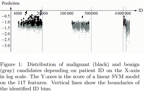
Data Leakage Example — KDD Cup 2008 [source]
- Data Leakage: This happens when features or attributes in the training and validation data unintentionally leak information that would otherwise not appear at inference time. A classic example of this is the KDD competition in 2008, on early breast cancer detection, where one of the features (patient ID) was found to be heavily correlated with the target class.
We can circumvent these problems by introducing an additional step for model understanding before deploying the models in the wild. By interpreting the model, we can gain a much deeper understanding and address problems like bias, leakage and trust.
But, what is Interpretability?
Interpretability is the degree to which a human can consistently estimate what a model will predict, how well the human can understand and follow the model’s prediction and finally, how well a human can detect when a model has made a mistake.
Interpretability though means different things to different people:
- For a data scientist, it means to understand the model better, to see cases where the model does well or badly and why. This understanding helps the data scientist to build more robust models.
- For a business stakeholder, it means to gain a deeper understanding of why an AI system made a particular decision to ensure fairness and to protect its users and brand.
- For a user, it means to understand why a model made a decision and to allow for meaningful challenge if the model made a mistake.
- For an expert or regulator, it means to audit the AI system and follow the decision trail especially when things go wrong.
It is important to be mindful of these different personas when you talk about interpretability and model understanding.
Model Transparency
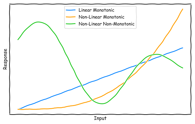
Model Complexity
The interpretability of a model can be characterized by how complex the learned response function is to the input features. The graph above shows three different types of response functions:
- Linear, Monotonic: These are the most interpretable functions as changes to the input features result in a proportional change to the target variable in a single direction (either positive or negative). This allows us to compute relative feature importance measures and reason codes. Reason codes are useful to understand why the learned model is predicting high or low for a specific input. It gives us a qualitative measure of the predictive influence of the input features, i.e. whether it is strong, weak, positive or negative.
- Non-Linear, Monotonic: Most response functions learned by machine learning algorithms are non-linear. Monotonicity ensures that the relative changes to the input features result in changes to the target variable in a single direction. Non-linear, monotonic functions are also interpretable as it allows us to compute relative feature importance measures and reason codes.
- Non-Linear, Non-Monotonic: These are the most common functions learned by modern machine learning algorithms and are the hardest to interpret. This is because changes in the input variables result in changes to the target variable in any direction and at a varying rate. The only interpretable measure that we can calculate for such functions is relative feature importance. Interpreting such functions is the main focus of this article.
Beyond Feature Importance
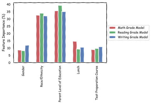
Feature Importance
Let’s now look at a concrete example. The problem is to predict math, reading and writing grades for high-school students in the U.S. We are given historical data that include features like — gender, race/ethnicity (which is anonymized), parent level of education, whether the student ate a standard/free/subsidized lunch and the level of preparation for tests. Given this data, I trained a multi-class random forest model [source code].
In order to explain what the model has learned, one of the simplest techniques is to look at the relative feature importance. Feature importance measures how big an impact a given feature has on predicting the outcome. From the graph above, it looks like the two most important features are — parent level of education and race/ethnicity. This is useful information but it does not tell us anything about how the grade is influenced by different levels of education and also how race and education interact with each other.
Enter, Partial Dependency Plots (PDPs)!
PDPs show us the marginal effect of features on the predicted outcome. In Python, you can use the implementation in scikit-learn which limits you to gradient boosted regressors/classifiers. A better implementation is PDPBoxdeveloped by Jiangchun Lee. The library is inspired by ICEBox, a PDP implementation for R, and supports all scikit-learn machine learning models. You can install this library as follows.
pip install pdpbox
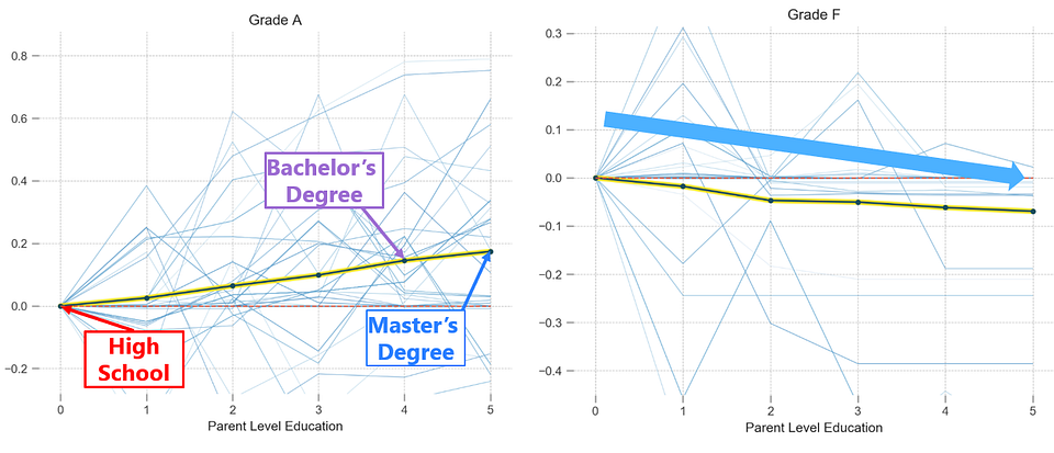
Partial Dependency Plots for Parent Level of Education in predicting Math Grades A and F
Now let’s see PDP in action. The plot above shows the influence of different levels of education on predicting grades A and F for math. As you go from left to right on the x-axis, the parent level of education increases, starting from high school going all the way to a master’s degree. You will notice that the impact on predicting grade A increases as the parent level of education increases. You see a similar downward trend for grade F, i.e. the more educated the parent is, the less impact it has on predicting grade F. This analysis shows that parent level of education is a valid feature. You can generate the above plots in Python using the following code snippet.
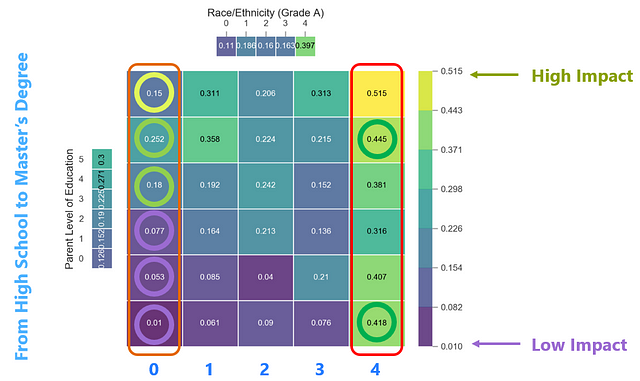
Interaction between Parent Level of Education and Ethnicity in predicting Math Grade A
Let’s now look at feature interactions on predicting grade A in math. I’ve picked the two most important features here. The parent level of education is on the y-axis and as you go from bottom to the top, the level of education increases. The anonymized race or ethnicity of the student is shown on the x-axis where different points represent different races — there are 5 distinct groups in this study. Please note the colors in the heatmap as well — violet/blue represents low impact in predicting grade A and green/yellow represents high impact.
Marginalizing on group 0, you can see that as the parent level of education increases, the impact on predicting grade A also increases. This makes sense as it shows the level of education has more influence on the grade than the race. The model has therefore learned this correlation well. But what is going on with group 5? It looks like regardless of the level of education, if the student belongs to group 5, then that has a strong influence on predicting grade A. This looks fishy to me and it exposes —
- a problem with the data where there may be sampling bias,
- a problem with the model, and/or
- a systemic problem in society
It turns out the Kaggle dataset used here is contrived and group 5 isn’t properly represented. Regardless, the main point is that none of these insights would’ve been possible by just looking at feature importance. The above interaction plot can be generated in Python as follows.
Sidebar on Decision Trees
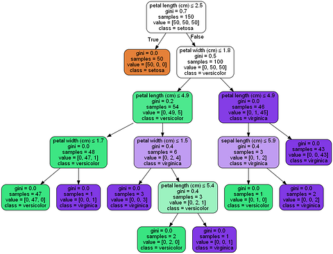
Simple Decision Tree
I want to debunk a common misconception about decision trees — that they are extremely interpretable. Let’s again look at a concrete example — the Iris flower dataset. The problem is to predict if a given Iris flower is either Setosa, Versicolor or Virginica based on 4 features — the petal length and width, and the sepal length and width. I’ve trained a simple decision tree for this classification task [source code] and you can easily visualize the trained model in scikit-learn, shown above. As you go down different branches in the tree, you can see how the features influence the model’s decision and it is very easily understood by a layman.
Let’s now look at a slightly more challenging problem. A hospital wants to use an AI system for early detection of breast cancer. This is an example where model understanding is critical as it is a life or death situation. In the dataset, we are given 30 different features. I’ve again trained a simple decision tree for this binary classification task [source code]. From the visualization below, you can see that as the number of features increases, the complexity of the decision tree also increases and it becomes much harder to interpret.
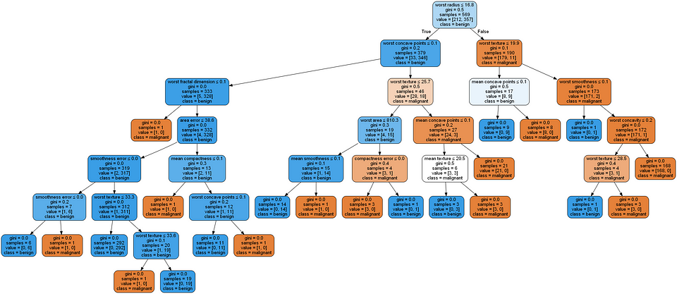
Complex Decision Tree
You might say that we can reduce the size of the feature space through dimensionality reduction and that’s perfectly valid. But you have to understand that there is a trade-off you are making here — you are trading off accuracy for simplicity. This may not be the right strategy to take especially for such a critical decision. A decision tree is therefore not a silver bullet to address the interpretability problem.
Post-Hoc Explanations
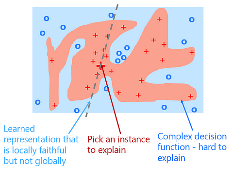
LIME: Local Interpretable Model-agnostic Explanations
Let’s go back to the breast cancer detection problem. Since accuracy is important for such a critical task, what if we trained a more complex ensemble of trees (like random forest or gradient boosted trees) or even a black-box neural network? How can we interpret such complex models?
Suppose that the complex model you trained learns the decision function as shown above to separate the malignant cells (in red) from the benign cells (in blue). An approach to interpret this complex model is to pick an instance that you want to explain. Then train a simpler linear model that approximates the complex model around that instance. This means that we use the simpler model to explain that one instance by looking at similar cases around it. The learned representation is therefore locally faithful but not globally. This post-hoc explanation technique is called LIME and it stands for Local Interpretable Model-agnostic Explanations. It was proposed in 2016 and has gained a lot of popularity since (5343 stars on Github as of 05-Mar-2019).
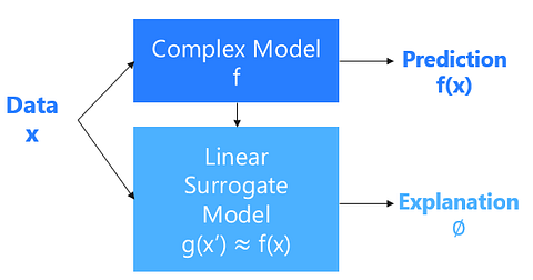
Illustration of Surrogate Models
Now let’s take a look at it from a different angle. We’ve got data of different breast cancer cells that we want to classify, represented as x in the block diagram. We are training a model that learns a complex function f that separates the benign cases from the malignant cases. We then train a simple linear surrogate model g that explains one instance x’ by approximating the complex function around that point. The parameters learned by that simpler model is the explanation. This is shown mathematically below.
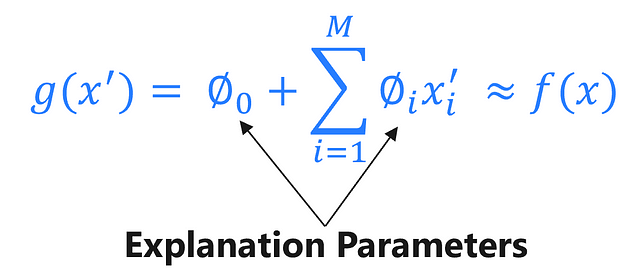
Additive Feature Attribution Method
In the equation above, x’_i is a binary variable that is used to sample instances around the picked instance and M represents the number of simplified input features. LIME is therefore an additive feature attribution method.
A framework was proposed by Scott M. Lundberg et al at NeurIPS 2017 that unifies various additive feature attribution methods including LIME. In the paper, SHAP (which stands for SHapley Additive exPlanation) values were used as a unified measure of feature importance. A Python implementation of SHAP was released in 2017 unifying LIME and other techniques like DeepLIFT and tree interpreters. The library is also gaining in popularity since its release (3909 stars on Github as of 03-Mar-2019). You can install SHAP as follows.
pip install shap
Now for the breast cancer detection problem, I’ve trained a random forest classifier [source code] obtaining an average precision of 100% on the hold out test set — see PR curve below.

Precision-Recall Curve for Random Forest Breast Cancer Classifier
In order to explain the model, I’ve picked a malignant case to run through the SHAP tree explainer. The model has predicted this case to be malignant with probability 0.9. The base rate of malignancy in this dataset is 0.6251. The explanation provided by SHAP is shown below — where positive impact is represented by red and negative impact is represented by blue. You can see how different feature values push the base prediction up to 90% certainty. The features with the largest positive impact are — worst area, worst concave points and mean concave points.

SHAP Explanation for Malignant Case
A similar explanation can be obtained for a benign case as well. I picked a benign cell for which the model predicted so with 100% certainty, i.e. 0% chance that it is malignant. You can see from the explanation below how various feature values pushed the base probability of malignancy down from 0.6251 to 0. The features with the largest negative impact are — worst concave points, mean perimeter and worst radius. This explanation is great as it gives us a much deeper understanding of how the model arrived at the final prediction.

SHAP Explanation for Benign Case
The above explanations can be generated using the below code snippet — the entire source code can be found here.
You can also use SHAP to visualize the average impact of each of the features in predicting the target classes. This is shown by the plot on the left below. You can see that the two most important feature are — worst concave points and mean concave points. The plot on the right shows the interaction between these two features in predicting the malignant class.
SHAP can also be used to explain black box deep learning models. Below is an example of SHAP explaining a convolutional neural network trained on the MNIST dataset. The SHAP DeepLIFT implementation was used to explain the predictions. The pixels in red indicate high impact on predicting the digit. It’s interesting to note that the DeepExplainer model has picked up some good explanations — for instance, the blank middle for digit 0 and the lack of connection between the two vertical lines for digit 4. There are more cool examples in the SHAP respository.
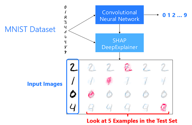
SHAP DeepLift Explainer for Convolutional Neural Networks
MOAR Tools!
I’ve barely scratched the surface in this article and there are more interpretability techniques that you can apply such as:
- generating text explanations using RNN language models
- using saliency maps to explain what a model is focusing on
- using representational learning and qualitatively visualizing it using techniques like t-SNE
I’ve added a lot of resources on this Github page for further reading.
Challenges with Transparency
I want to end with a caveat. In an interesting paper by Adrian Weller, he makes the argument that AI transparency should be a means to a goal and not the goal itself. Dr. Weller draws on multi-agent game theory to show that more transparency could lead to an unfavorable global outcome for all and could expose AI to abuse by malicious actors. It goes without saying that AI systems must be secure and safeguarded against adversarial attacks. This is again another active area of research and deserves a separate blog post!

