Quickly summarise and describe datasets with python
The python programming language has a large number of both built-in functions and libraries for data analysis. Combining some of these libraries can produce very powerful methods of summarising, describing and filtering large amounts of data.
In this article, I want to share some tips on how to combine pandas, matplotlib and some built-in python functionality to very quickly analyse a dataset.
All libraries in this post can be installed via the package manager pip.
Data
In this article, I am going to be using a data set known as the adult income dataset which can be downloaded from the UCI machine learning repository. This dataset contains a number of features about each adult and a target variable which tells us whether or not they earn over £50,000 pa.
Here are all the imports for the libraries that I am using.
I am using pandas to read in the dataset and return the first few rows.

This dataset is usually used to build a machine learning model which predicts the income class from the features. However, before getting to the model building stage it is useful to perform some data analysis first.
Describe
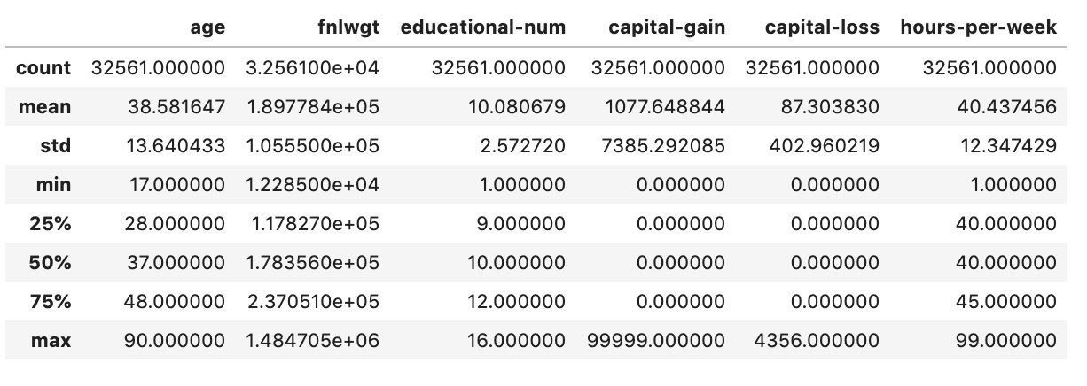
The describe function allows us to very quickly look at some basic descriptive statistics for the numerical features in the dataset. Running data.describe() we can see that our dataset has 32,561 rows, we can see the mean value in each numerical feature and get a view of the distribution of values in each of these features.
Value counts
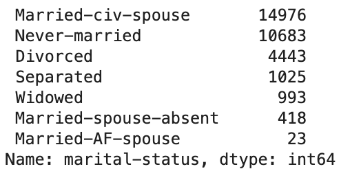
In this dataset, we also have categorical variables and it will also be useful to get a basic understanding of the distribution for these. The value_counts() function provides a very simple way to do this. Let’s use this to inspect the marital-status feature.
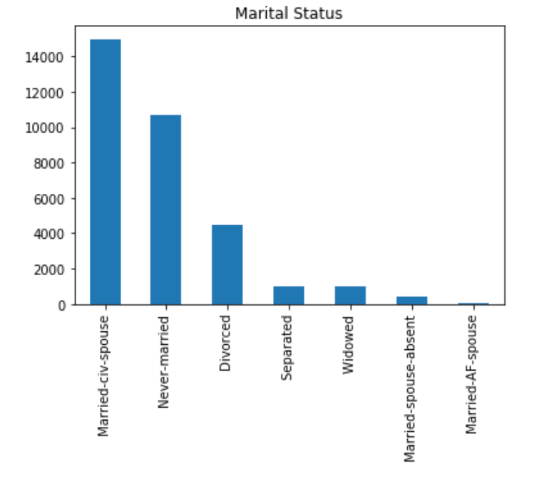
To make this easier to visualise we can quickly create a bar plot for this value by adding just a small amount of extra code. The title is optional, and you can customise axis labels, colours and other aspects of the chart with the usual matplotlib functionality.
Plotting with value counts doesn’t work so well when we have a feature with high cardinality (a large number of unique values).
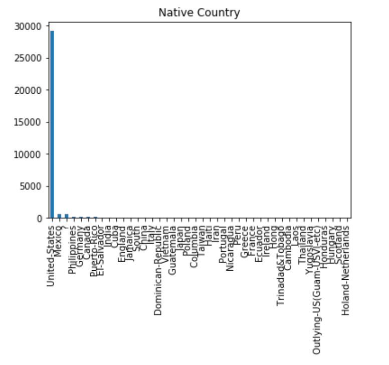
For a feature like native-country, it would be more useful to plot only the top n values as this gives us a useful insight. We can do this by adding just a little more code.

Pandas groupby
The pandas groupby function is very useful when we have data where we want to compare segments. In this dataset, we want to perform analysis to understand the differences, and magnitude of differences in the features between the two income classes. The pandas groupby function provides a very quick way to do this.
If we run the code below we can analyse the differences in mean, for all numerical values, between the two income groups.

A better way to compare the differences would be to view the variance in distributions for the two groups. A boxplot is a useful way to do that. This can be accomplished by using the plotting functionality alongside groupby. The visualisation is shown below.

You will notice that as the values are on different scales it is difficult to compare the two distributions. To overcome this we can scale the values. To do this I am using the scikit-learn MinMaxScaler function. This scales the values so that they all lie between 0 and 1. We can now clearly see substantial differences between some of the features such as age and hours-per-week.

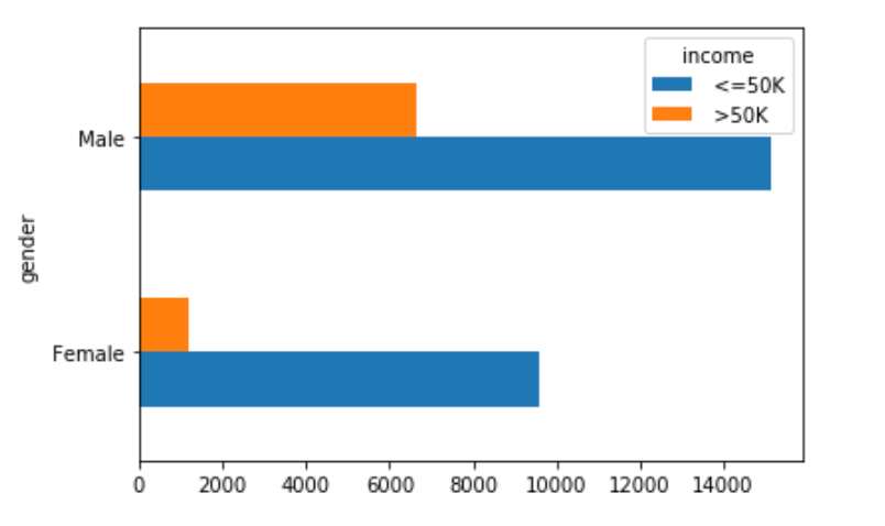
We can also use the groupby function to compare categorical features. In the below graph we can quickly identify that there are a higher number of males compared to females in the higher income bracket.
Pivot tables
Pandas has functionality that enables you to create spreadsheet-style pivot tables in python. Pivot tables allow you to quickly summarise, group and filter data to perform more complex analyses.
We can use the pivot table to explore more complex relationships. Let’s look a little deeper into the relationship between gender and income class. Do females earn less because they work fewer hours per week?
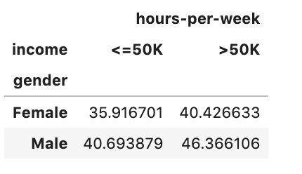
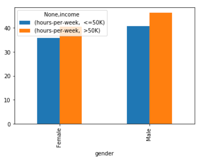
We can add plotting functionality to make this easier to visualise.
All the methods described above can be extended to create much richer and more complex analyses.

