Ready to learn Data Science? Browse courses like Effective Data Visualization developed by industry thought leaders and Experfy in Harvard Innovation Lab.
How ignoring the grammar of graphics can destroy even legendary data visualizations
“Lions are mammals belonging to the cat family” “eating is the ingestion of food to provide an organism with energy” “giraffes are the tallest living animals”.
Does the above sentence make any sense? Writing about the eating habits of lions, I forced myself to use phrases or sentences, instead of the conventional way. The same sentence when composed naturally would come out to be:
“Lions eat giraffes”
Now that’s succinct and makes a lot more sense. We are so used to this way of composing sentences in any language that we take it for granted in our day-to-day communication. But, why should consumption of data be any different?
Why do we artificially impose constraints of communicating using monolithic charts? While presenting analytical insights, data science practitioners think templatized dashboards and readymade charts. Sales trends become bar charts in a ‘KPI section’ at the top, while product mix is a pie chart below, and so on.
This is just the same as forcing communication using preset sentences, rather than stringing together the right set of words, to convey an elegant message. Unfortunately, this malaise is way too common today, and every time this happens, an information designer’s heart bleeds.
Not convinced yet?
Just in case you’re still wondering what I’m getting to, lets try an interesting experiment. We’ll pick an elegant visual, widely considered to be an all-time best, and find out what would happen if we use a staid, templatized approach to presenting the very same data.
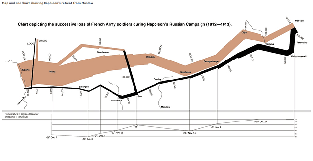
Let’s subject ‘Napoleon’s Russian Campaign’ created by Charles Minard to this test. This is a classic, timeless visualisation, considered by Edware Tufte to be the best visualization ever created. This graphic, hand drawn in 1869 was composed by freely letting the data talk its own story, just the right way. With this trial, I do hope Minard doesn’t turn in his grave!
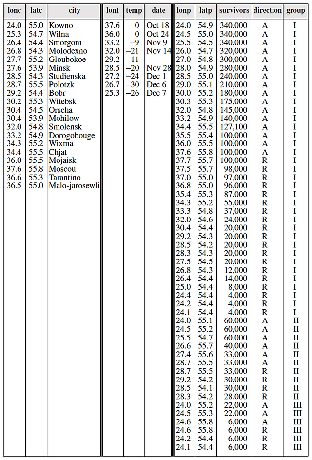
I first picked the data below, which was recreated by Leland Wilkinson from the visual, and is published in his book, which is also the focus of this article. There are three datasets below: the first one shows the cities that Napoleon’s army marched through, along with their lat-long.
The second data shows the longitude of places and their temperatures on the quoted dates, that highlights the harsh winter on the army’s retreat. The third dataset shows the soldier count at each lat-long, their direction of march (forward or retreat) and if it was the main group, or a splintered one.
Now, lets assume that this data were emailed to us from the campaign frontline, and our manager tasked us to create a visualisation overnight. An immediate impulse is to feed this into the corporate dashboarding assembly line. Data goes in from one end on a conveyer belt, robot-arms use preset moulds of dashboard layouts and readymade charts to force-fit them. And out comes a shiny, interactive, colourful piece-of-junk from the other end. Well, almost.
I tried applying a crude templatization approach like the above, to “Napoleon’s March” to see how we may start with a similar data, but lose all elegance to end up with a corporate-style dashboard using pre-built charts. Here is the final result:
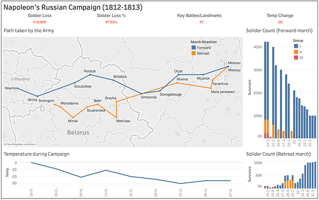
How we killed Charles Minard’s storytelling using the modern dashboarding assembly line
We’ve managed to destroy the narrative, and the legendary data story has been downsized into a petty, ineffective dashboard. I used Tableau public to put this together, but as a strong disclaimer, the issue is NOT with the tool. Tableau is a great tool and so are many others in the market. The issue is always with methodology adopted and a creator’s unimaginative treatment.
A syntax for graphics?
Yes, graphics do have a syntax, and it is possible to pick the right set of underlying elements to compose elegant visuals, rather than clambering around with rigid, pre-built charts. When we embrace these key entities of information design, it endows us with the power to construct any visual.
Leaning on the excellent foundation established by Leland Wilkinson in his book, The Grammar of Graphics, we will understand the fluid construction of elegant graphics. Using a simple example, we will see how to build a superior visual with data elements, layer by layer. We’ll also prove that not all charts need to have standard names.
Grammar makes language expressive. A language that has words and no grammar expresses only as many ideas as there are words. — Leland Wilkinson
What works for English grammar?
For quick context, lets look at how we intuitively construct sentences in the English language. John’s actions on the playground are communicated by bringing in the various parts of speech and stringing them together.
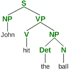
Any simple rewording can totally alter the structure. For instance, if we swapped the last two words with the first, the sentence turns into “The ball hit John”. A cosmetic change, but the result is not quite the same anymore!
Introducing the Grammar of Graphics
To make graphics or visual representations expressive, one must understand their underlying syntactical structure as well. Grammar of graphics provides a standard set of guidelines on converting data into effective visualisations that tell their story.
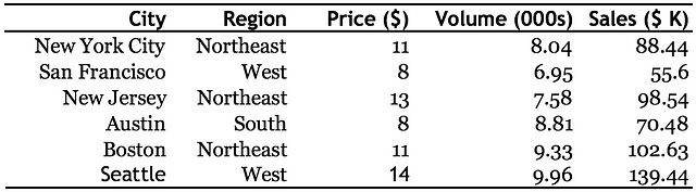
Lets assume we have the following data to be presented, and it shows the sales performance across 6 cities in the US.
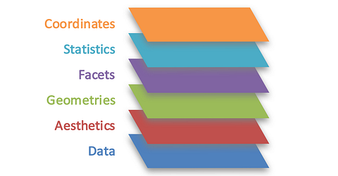
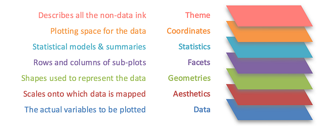
There are 7 layers of grammatical elements in the grammar of graphics. Lets look at each starting from the underlying layers, and moving upwards. This concept is best illustrated with examples, as we go along. We’ll use ggplot2, a high-level charting package on R, which was also inspired by the same book.
If you’re not into coding, don’t worry. The snippets of code shown below are only for illustrative purposes and one doesn’t need to know programming to follow. Just glance at the tags and see how the visual changes when each word is incrementally added. This needs no more than plain English understanding.
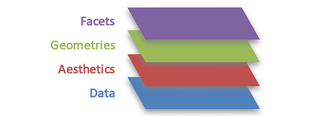
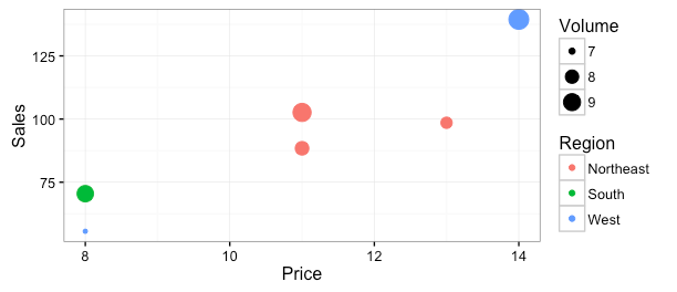
Layers 1–2–3: Data — Aesthetics — Geometries
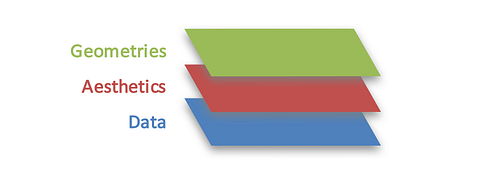
Data is the fundamental base layer, with the elements to be plotted. Aesthetics layer provides the axes and encoding elements for data. Geometrieslayer holds the shapes the can be used to represent the data.
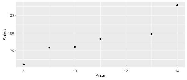
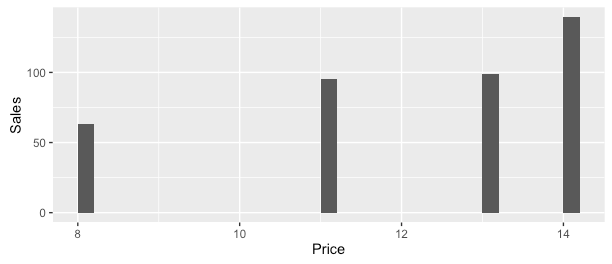
Here is a simple command to plot the sales against price for each of the cities, using the 3 layers shown above. Note how the layers are explicitly called out, data is mapped to the input data frame, aesthetics layer associates the columns to x-y axes, and geometry asks for showing the shapes as points.
ggplot(data, aes(x=Price, y=Sales)) + geom_point()
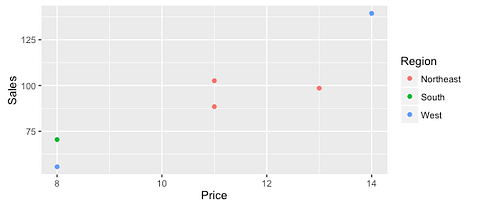
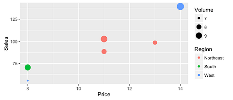
No, this is not a syntax to create a scatter plot. To show how one can play with these 3 layers by encoding more elements, lets now colour the points by theregion that the city belongs to (left plot). Then, we differentiate the cities by showing the sales volume as the point’s size (right plot). Note that there are just 2 additions to the command, as emphasised below.
ggplot(data, aes(x=Price, y=Sales, color=Region, size=Volume)) + geom_point()
Layer 4: Facets
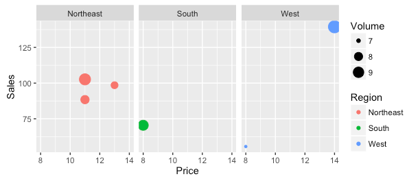
We now add a 4th layer on top, called ‘Facets’. As the name implies, this is used to facet out by creating subplots. At times it is helpful to split and compare plots side by side, to highlight the differences more clearly.
To the same command and plot from above, we ask for the visual to be split apart based on ‘regions’, rather than showing everything in a single chart.
ggplot(data, aes(x=Price, y=Sales, color=Region, size=Volume)) + geom_point() + facet_wrap(~Region)
Layer 5: Statistics
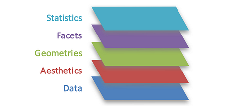
The 5th layer is ‘Statistics’, which provides a way to introduce statistical models and summaries such as mean, median, distributions. Its often useful to show the underlying statistics, and the grammar provides a way to do this.
Let’s say that we wanted to compute the average sales at each of the pricepoints. We can dynamically add this by just including one parameter to the same command, which causes cities with same price point to be aggregated.
ggplot(data, aes(x=Price, y=Sales)) + stat_summary_bin(fun.y = “mean”, geom = “bar”)
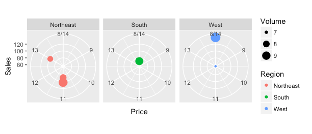
Layer 6: Coordinates
At times there is a need to change the coordinate system for plotting. Default cartesian coordinates or x-y plots shown above can thus be transformed. One could switch this into, say a polar coordinate, which happens to be the base for charts like the (un)popular pie or donut charts.
One single addition to the command with an intuitive naming transforms the entire visual without having to modify any of the base layers. Though not very appropriate or easy to read for our data, this gives an idea of how its done. Is the below a variant of ‘spider or radar chart’ or ‘bubble on circular plot’? We’re already inventing representations!
ggplot(data, aes(x=Price, y=Sales, color=Region, size=Volume)) + geom_point() + facet_wrap(~Region) + coord_polar()
Layer 7: Theme
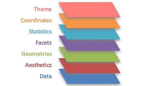
The final layer in the grammar is ‘Theme’ which can be conveniently used for any non-data ink. Examples include chart or axes title, labels, background colour schemes and the like. This layer is where stories can be annotated by blending in non-data ink along with the data ink.
As with other layers, adding a single parameter ‘theme_bw’ below, transforms the foreground — background from the default gray scale earlier into a black-on-white theme. Equally easy ways exist to add title, labels, margins or lines.
ggplot(data, aes(x=Price, y=Sales, color=Region, size=Volume)) + geom_point() + theme_bw()
Thus, we’ve seen how a syntax for graphics can come in handy to seamlessly compose data onto the most appropriate elements. If the intent is to compare sales of two products, plot them as the length aesthetic of the bar shaped geometry. If you want to see how the growth of these products vary, bring this in as the width aesthetic. No, please don’t think bar charts yet!
Want to see the margins of these products as well? Encode them as the colour aesthetic. Want to compare the products across companies? Facet the plot to split the view side-by-side, and compare the two companies easily. Before you share it with your users, add copious text using the theme layer.
The key risk with thinking in terms of charts is that, as requirements are added, the thought process is invariably stalled. A mind imagining rigid charts soon runs dry of versatile representations.
Summary
Grammar of Graphics: A layered approach to elegant visuals
We’ve looked at the fundamental building blocks for a flexible presentation of data. The real power of this concept lies in uncaging your data from the confines of monolithic charts and setting them free, to tell their own expressive story.
Though many visualization tools today don’t adopt a grammar of graphics approach in its entirety, that seems to be the way forward. Meanwhile there are opportunities for people to start putting this to practice. This is so important that it must be made mandatory education for anyone working with data, whether it is analysts, designers, data scientists or journalists.