Using Azure Databricks, Python, Spark and Power BI python script visuals
A. Introduction
Every now and then, you run into new unique problems to solve. This time it was a client getting nested IoT data. Storing and visualizing IoT data is usually a standard task, but getting nested IoT data as a “matrix” per message with corresponding vectors is not as straightforward as usual.
In this post, we will learn:
- how to transform nested IoT data in a scalable way
- how to create custom python visualizations in Power BI
- how data can be consumed and visualized by non-technical end-users through a web browser
We will use Python, Spark and Power BI to solve our problem in some simple steps.
B. Data Structure
First, let’s take a look at what the data looks like when it comes from the IoT devices:
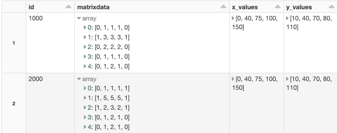
In the picture above we can see a subset of the IoT data that we will focus on to solve the specific problem with a “matrix” type of data per message/row. The IoT data contains many other columns of standard types, but we will only look at how to handle the complex types in this post.
Each position and value in the “matrix” are connected to a specific x_value and y_value. See the picture below.
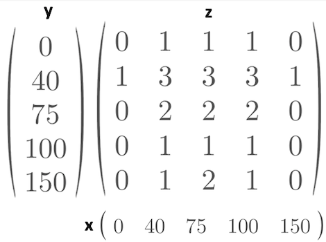
z = f(x,y)
1 = f(0,40)
3 = f(40,40)
2 = f(100,75)
This is how we get the raw data from the IoT devices. In reality, the matrix is much larger, but for simplicity we use a matrix of size 5×5 here. The approach we will use will also work for larger matrices.
For every combination of x and y we have one z value. Our task is to transform the data so it can be used and visualized in Power BI. BI-tools can´t consume the raw data in the compact form we receive from the IoT devices. BI-tools usually want tabular data. So we want to create a regular table looking like this:
[id ][X-value] [y-value] [z-value] [any meta-data-column(s)]
1000    0        10         0            meta-data
1000   20        30         2            meta-data
...
C. Transforming the data
We want to transform the raw source data, where every row consists of:
- a matrix of z-values
- an array of x-values
- an array of y-values
into a regular table of unique rows making up all possible combinations of the data.
C0. A note about Spark
In this example, we will work with a limited amount of data. In a production environment, we often have several Terabytes of data, so we want to use a technology that scales with the incoming IoT data. Therefore we will look at how to solve this problem using Spark.
We will use Azure Databricks and Spark to transform the data. We will have our data in a Spark DataFrame. We can see above that the matrix is stored as arrays in an array in the Spark DataFrame.
C1. Generate test data
Let’s generate some test data to work with.
This gives us a spark DataFrame looking like this:
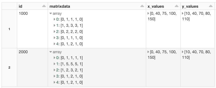
We get the IoT data in a compact form as described above Z = f(x,y), but Power BI does not understand that form so we need to create a regular table of the data. Spark has built-in functions to help us. The function we are after in this case is:
posexplode(col)
In short posexplode will create a new column with the exploded data and additional rows for the column we chose to explode. Also, we will get an extra column with the position/index of where the explode comes from in the original data structure. See docs here.
We need to get every single value of the “matrix” on its own row with the index of the x- and y-coordinate so that we can match the correct z-value with the correct x- and y-value.

As we can see in the display of the first posexplode above we have exploded the first array of the column “matrixdata” in a new column called “values”. We also store from what row of the “matrix” we have exploded the data in the column called “y_index”. I have kept the “matrixdata” column to make it easier to follow, even though we technically don’t need the column anymore.
Next, we need to posexplode the resulting values:

So, in the end, we get z_value with x_index and y_index. The last part is to match the x_index with the same index in the x_values column and the same for the y_index with the y_values column.
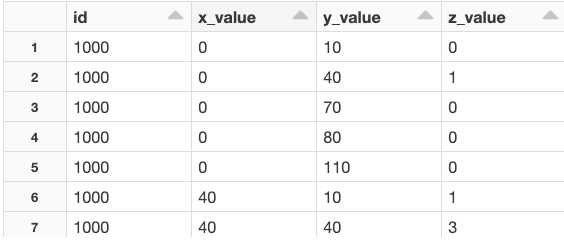
Now we have a regular table with our data that can be consumed by Power BI.
D. Exporting the data
D0. Export to Data Lake
Let’s export the data to our Storage Account as a CSV file. We will use Pandas to export the Spark DataFrame to a named CSV. For larger amounts of data, we would use Spark directly. The variable path_export holds the mounted path in our Data Lake. Later we will load the CSV file from Power BI.
We need to preface the mounted path with /dbfs/ when we work with single node libraries and local file API.
D1. Alternative local export
If we don’t have a data lake account we can, for test purposes, export the CSV to our local computer and import the CSV into Power BI from the local file. Azure Databricks comes with a DBFS filesystem that is included in every workspace. We can export our CSV to DBFS and download the CSV file from the DBFS file system using Databricks CLI. See here how to install the Databricks CLI. Then we can download the file to our local computer with a CLI command like:
# Usage: databricks fs cp [OPTIONS] SRC DSTdatabricks fs cp dbfs:/path_we_exported_to/heatmap_from_spark.csv destinationpath
After that, we can load the CSV file into the Power BI desktop.
D2. A note about Pandas
We do not have any “big data” matrices and arrays so we allow us to use Pandas to export our Spark DataFrame as a named CSV. We could have exported the data as CSV directly from Spark in a scalable way, but we would then get CSV files named by spark and that would require some extra work before loading the data in Power BI. So we choose to use Pandas here as it fulfills our needs in this case. Also if we would have a huge amount of data we would not export the data as CSV. In that case, we could consume the data directly via direct queries from Power BI to Databricks. (Databricks and Microsoft have optimized the connection between Power BI and Databricks so the performance is much better nowadays than it used to be some time ago. Also, passthrough authentication via SSO is supported, but that is out of scope for this post.)
E. Visualization in Power BI
We now have our data as a table and want to visualize the data in Power BI. We can load data from a Data Lake Gen 2 account directly from Power BI. We can then use the built-in visualizations or download additional add-ons to visualize the data. In this example, we will use a python script visual from within Power BI. This allows us to create a custom visual in the way we want using Python.
E0. Making python visuals work in Power BI
The idea of using python from within Power BI is simple. We get a Pandas DataFrame into our script and then we can use selected python libs to visualize our data. It’s also possible to publish our report with the python visuals to the Power BI service online.
Set up Power BI desktop to work with python visuals:
- 1. This step is only needed if you are using a non-Windows computer like a MAC or Linux. Install Windows on a Virtual Machine or make sure you have access to a Windows installation as Power BI desktop requires Windows.
- 2. Install Power BI desktop if needed. Can be installed from the Microsoft Store.
- 3. Make sure you have the correct python environment matching Power BI python requirements. The python version and supported versions of packages are listed here: https://docs.microsoft.com/en-us/power-bi/connect-data/service-python-packages-support
When setting up Python on the VM (which I did as I use a MAC) I noticed a problem with NumPy and Windows 10 that forced me to use the 32-bit version of python, as a workaround, to make it work. - 4. Use the suggested versions in the link above and create the python environment using anaconda.
conda create —name powerbi377 python=3.7.7
activate powerbi377
pip install pandas==1.0.1
pip install matplotlib==3.2.1
- 5. Point Power BI to our python environment.
Start Power BI.
Select File -> Option and settings-> Options -> Python Scripting
Set the path to the anaconda environment we created.

Detected home directories: Other

Set Python Home Directory: C:\Users\YOURUSERNAME\Anaconda3\envs\powerbi377
Now we are ready to do some python coding in Power BI by simply dropping the python visual:
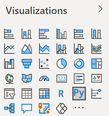

to the canvas. And you will get a script editor with the data as a Pandas DataFrame called dataset. You decide what fields of the table to use. In our case, we dropped x_value, y_value and z_value onto our canvas Py-script.
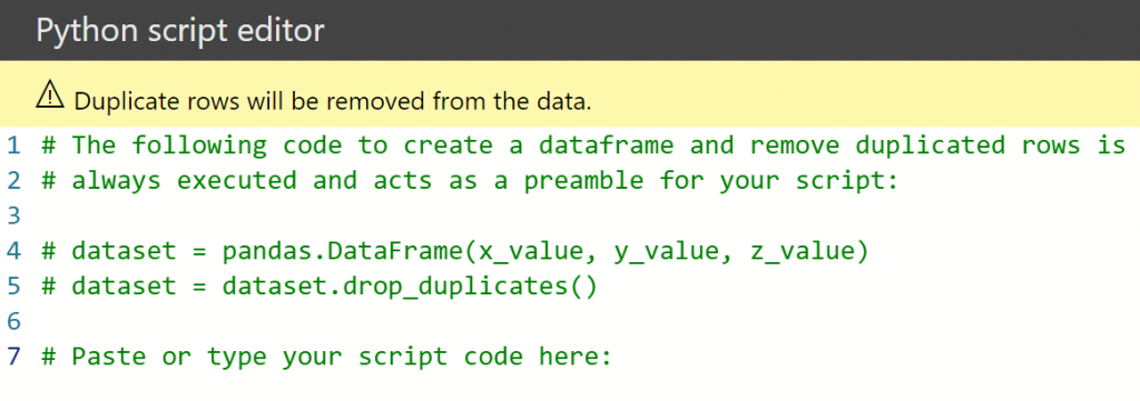
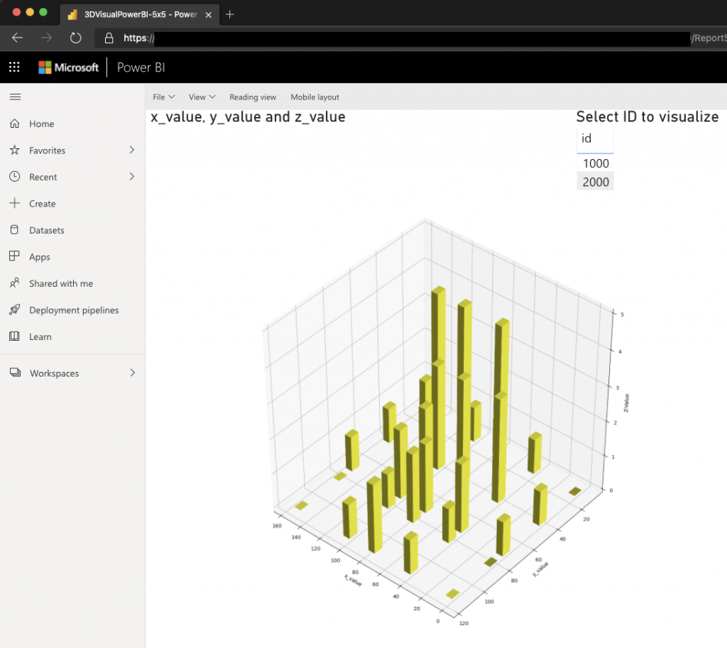
Now we can visualize our data using python and e.g. Matplotlib. Below is an example of plotting our data as a bar3d visualization, but you could choose the visualization you’d like.
We are using in the Power BI desktop client, but we want our end-users to be able to consume the data online in a browser. To achieve that we can publish our report to the Power BI service and let our end-users consume the report in the browser:
E.Conclusion
When we have nested structures of IoT data we can use built-in Spark scalable transformation to get the data in the shape we need.
We can consume the transformed data in Power BI by exporting the data to a data lake and loading it in Power BI or by using direct query.
If we want to visualize our data in Power BI in a way that is not supported by the built-in visualizations or by 3rd party extensions we can use python scripting visuals to visualize our data.
We need to carefully set up our python environment to match the versions supported in the Power BI service.
We can publish our custom python visuals to the Power BI service and share them with others so they can consume the reports online using a web browser.
A notebook (.ipynb) with the source code above can be found here.


