In the previous article, I prescribe prioritizing data sources inclusion in a data library according to business value, difficulty, and privacy concerns. This can be done utilizing a scoring rubric and interviewing the owners and/or key stakeholders of each data source. While these things may not be measurable they can be quantified in a relative sense. For example, do you expect that a data source will be more, less, or equally complex to automate as the average data source for your team?
The scoring rubric we use at TechSmith is shown below. It is designed so that each data source will have a 0 to 100 score along each dimension. While it is theoretically possible to end up with a score outside of that range, in practice we will trim outliers to fit within that range (which we have not needed to do).
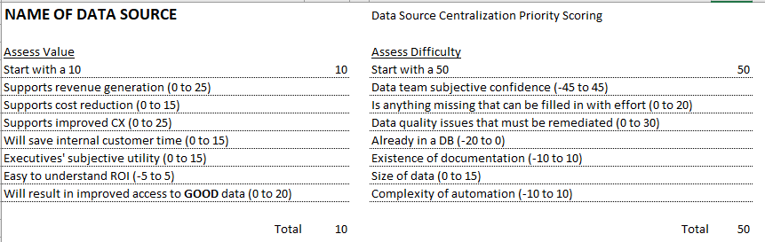
The items or scoring ranges on your list should be customized to your team and organization but this one may serve as a good starting point. After a half hour meeting with one to three key stakeholders we would discuss the list and come up with a score. For privacy concerns we did not have a rubric. Rather we identified data privacy requirements and then gave a score of low, medium, or high. Once the data source is scored we add it to our PICK chart visualization.
Creating a PICK Chart in R After Scoring a Data Source
According to Wikipedia, “PICK charts are a method to prioritize a number of action items or problem solving ideas.” The PICK acronym refers to the recommended action for the four quadrants created on the chart: Possible, Implement, Challenge, or Kill.
I created my version of the PICK chart with the R package ggplot2, which is part of the tidyverse group of packages. I also use a package called shadowtext to get a certain format on the chart, but this isn’t absolutely necessary. The R script starts then by including these packages:
library(tidyverse)
library(shadowtext)
Then I set parameters that are used to make the grid on the chart as well as choosing the background colors. You can change these if you want different colors or shades of these colors:
# Don’t change these - help make everything line up well
axis_min <- -4
axis_max <- 104
score_range <- axis_max - axis_min - 8
axis_mid <- (axis_max - axis_min) / 2 + axis_min
# You can change these colors and sizes
line_color <- "grey25"
yellow <- "#f5f378"
red <- "#e6706e"
orange <- "#f2bb63"
green <- "#60b570"
Q_size <- 8
proj_size <- 4
The plotting is done on a table with four columns. I imported this from my excel spreadsheet shared above. You either should create a table like this or edit the code that makes the chart:
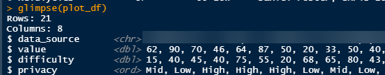
The value and difficulty columns are numeric, and the privacy column is an “Ordered factor.” I explicitly set it to know that there is a progression from Low -> Mid -> High.
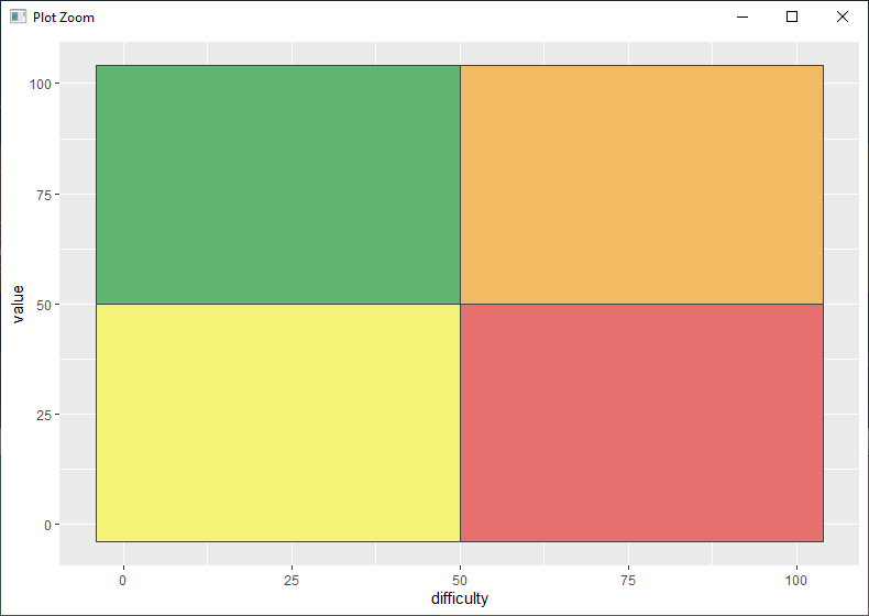
The first part of the ggplot object will create the plot, select the data, set values for y and x axes, and create the colored grid:
p <- ggplot(plot_df, aes(x = difficulty, y = value)) +
geom_rect(aes(xmin = axis_min, xmax = axis_mid, ymin = axis_min, ymax = axis_mid),
fill = yellow, color = line_color) + # lower-left
geom_rect(aes(xmin = axis_mid, xmax = axis_max, ymin = axis_min, ymax = axis_mid),
fill = red, color = line_color) + # lower-right
geom_rect(aes(xmin = axis_min, xmax = axis_mid, ymin = axis_mid, ymax = axis_max),
fill = green, color = line_color) + # upper-left
geom_rect(aes(xmin = axis_mid, xmax = axis_max, ymin = axis_mid, ymax = axis_max),
fill = orange, color = line_color) # upper-right
p
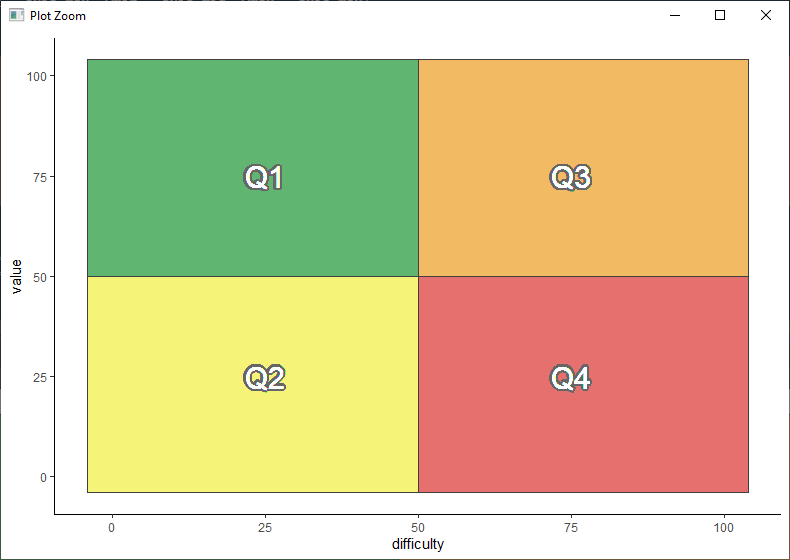
The next section adds the Q1-Q4 labels to each section of the chart and sets it to a clean “theme_classic”:
p <- p +
geom_shadowtext(aes(x = axis_mid / 2, y = axis_mid / 2),
label = "Q2", color = "white", size = Q_size, bg.color = "grey40") + # lower-left
geom_shadowtext(aes(x = axis_mid / 2 + axis_mid, y = axis_mid / 2),
label = "Q4", color = "white", size = Q_size, bg.color = "grey40") + # lower-right
geom_shadowtext(aes(x = axis_mid / 2, y = axis_mid / 2 + axis_mid),
label = "Q1", color = "white", size = Q_size, bg.color = "grey40") + # upper-left
geom_shadowtext(aes(x = axis_mid / 2 + axis_mid, y = axis_mid / 2 + axis_mid),
label = "Q3", color = "white", size = Q_size, bg.color = "grey40") + # upper-right
theme_classic()
p
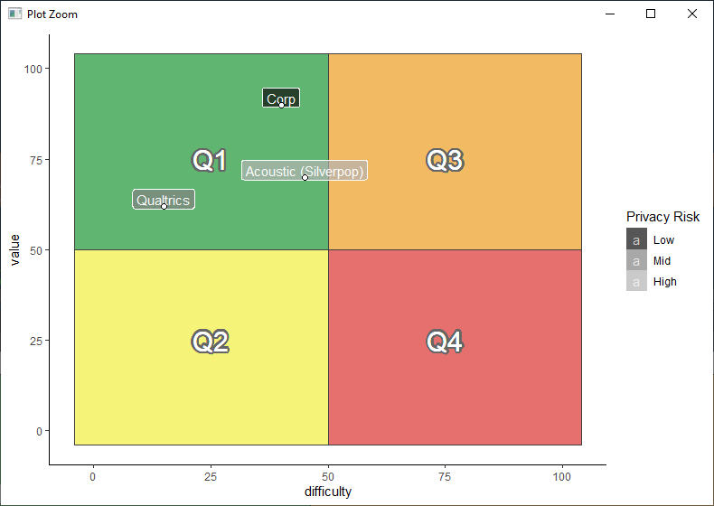
Now it is time to plot the systems on the chart. I have included several systems here as examples. Our real chart is full, with applications in every quadrant:
p <- p +
geom_label(aes(label = data_source, fill = privacy), size = proj_size, alpha = 0.7, color = "white", nudge_y = 2) +
scale_fill_grey(start = 0.05, end = 0.7, name = "Privacy Risk")
geom_point(color = "black", shape = 21, size = 2, fill = "white") +
p
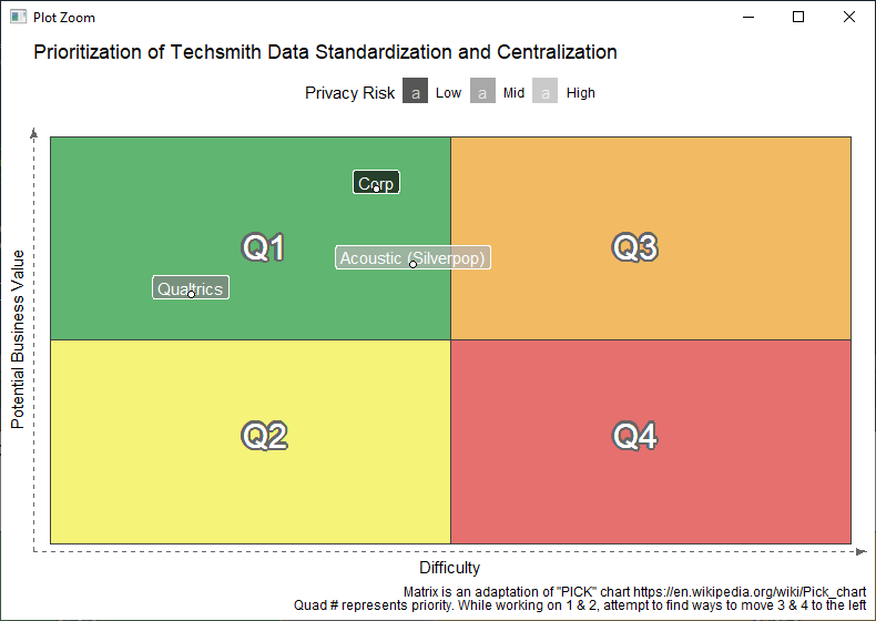
Finally let’s label the chart, remove unnecessary ink in things like axes labels, and get rid of white space:
p <- p + labs(x = "Difficulty",
y = "Potential Business Value",
caption = "Matrix is an adaptation of \"PICK\" chart https://en.wikipedia.org/wiki/Pick_chart
Quad # represents priority. While working on 1 & 2, attempt to find ways to move 3 & 4 to the left",
title = "Prioritization of Techsmith Data Standardization and Centralization") +
theme(axis.text = element_blank(),
axis.ticks = element_blank(),
axis.line = element_line(arrow = arrow(type = "closed", angle = 20, length = unit(0.1, "inches")),
color = "grey40", linetype = "dashed"),
legend.position = "top") +
scale_x_continuous(limits = c(axis_min , axis_max), expand = c(.02, .02)) +
scale_y_continuous(limits = c(axis_min , axis_max), expand = c(.02, .02))
p
In the final article I will describe how to develop a consistent, manageable process to add sources to a data library once you have prioritized the order.